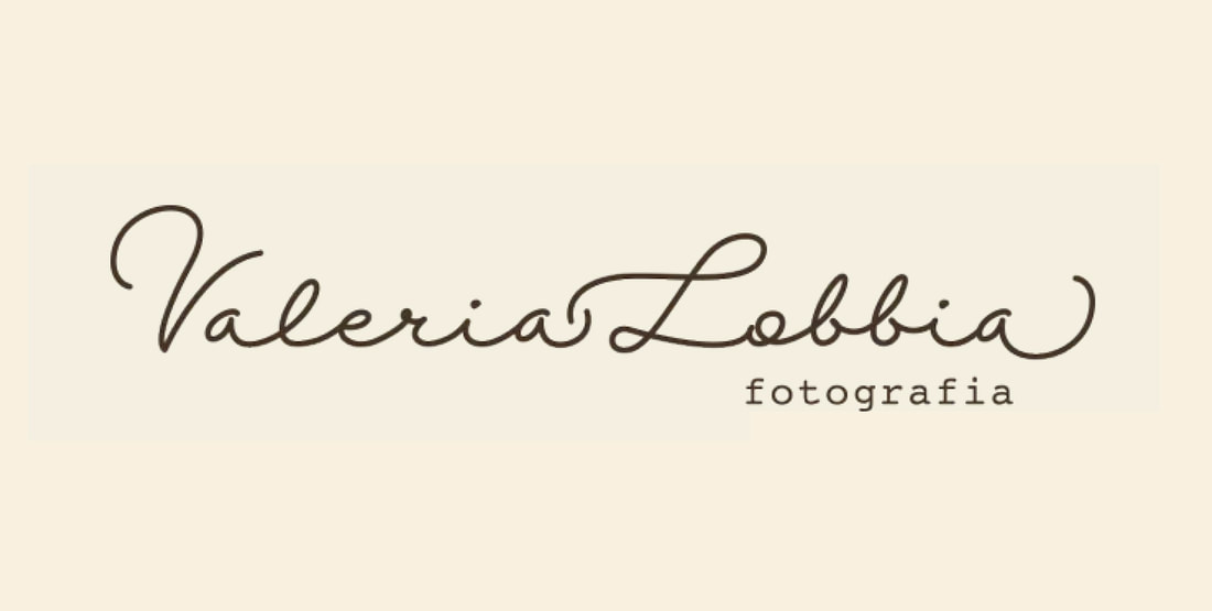
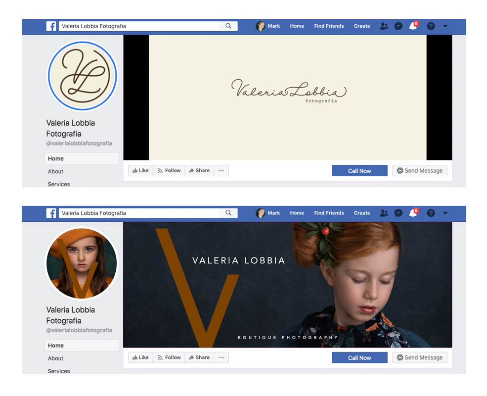
Having recently opened her own studio, Italian photographer Valeria Lobbia was accelerating a process of self-actualisation. After years of work for the local photography shop, she set out independently to develop her own creative vision as a portrait photographer. She came to us when she realised that she needed a rebrand to reflect her new-found style and confidence, as her current logo gave no indication of the stunning art portraits that were rich with classical art allusions.
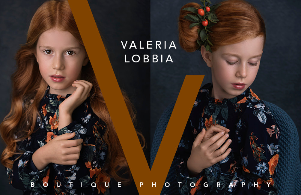
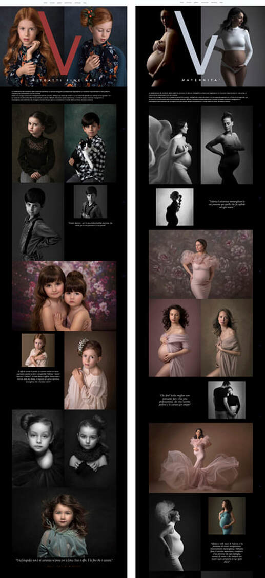
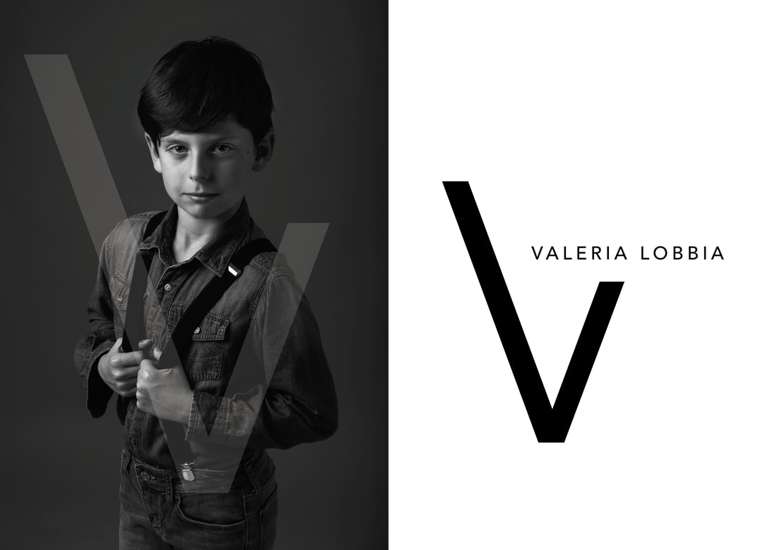
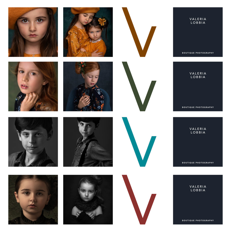
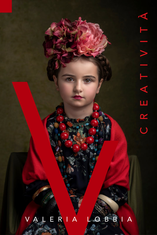
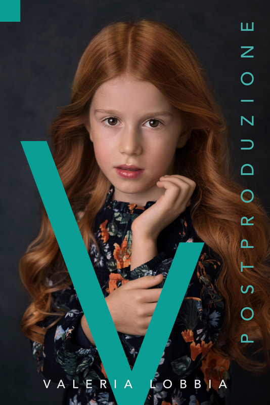
Valeria’s photographs often worked in stunning sequences, where subtle changes of expression and crop created an evocative dissonance. We disregarded the contemporary fashion for super-reductive logos in favour of using Valeria’s own work as part of her branding. Not many photographers would accept such strong graphics on top of their work, but we knew that this design would enhance rather than overwhelm her images, and strengthen her unique look.
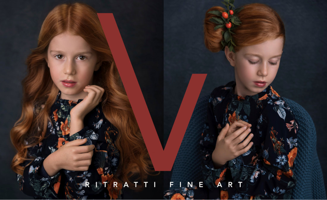
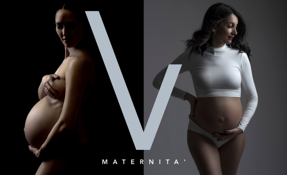
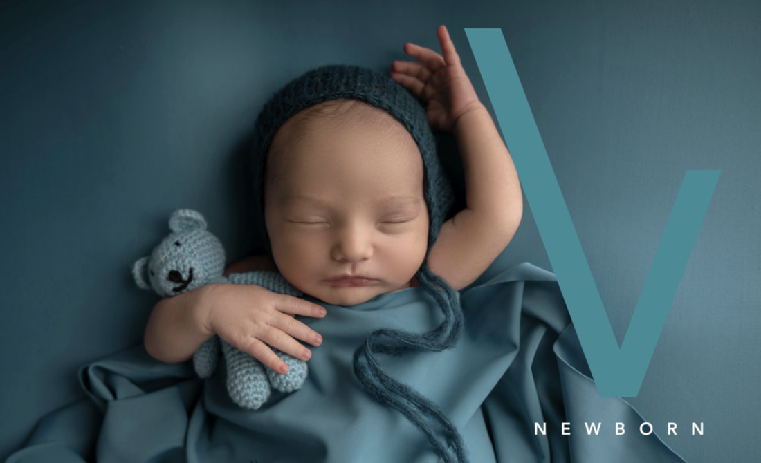
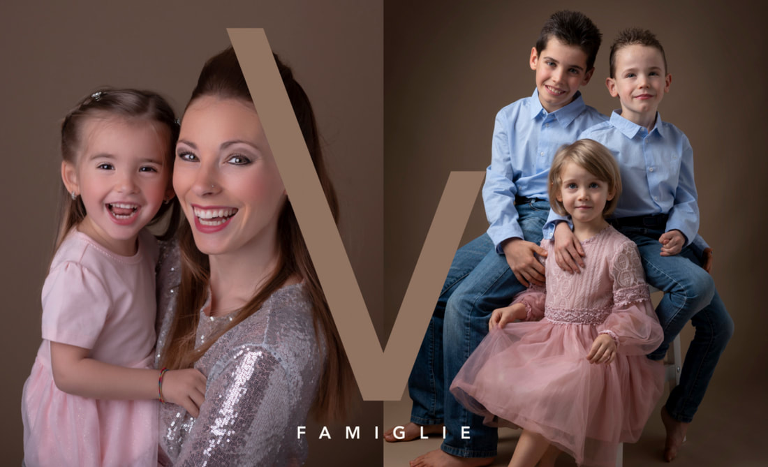
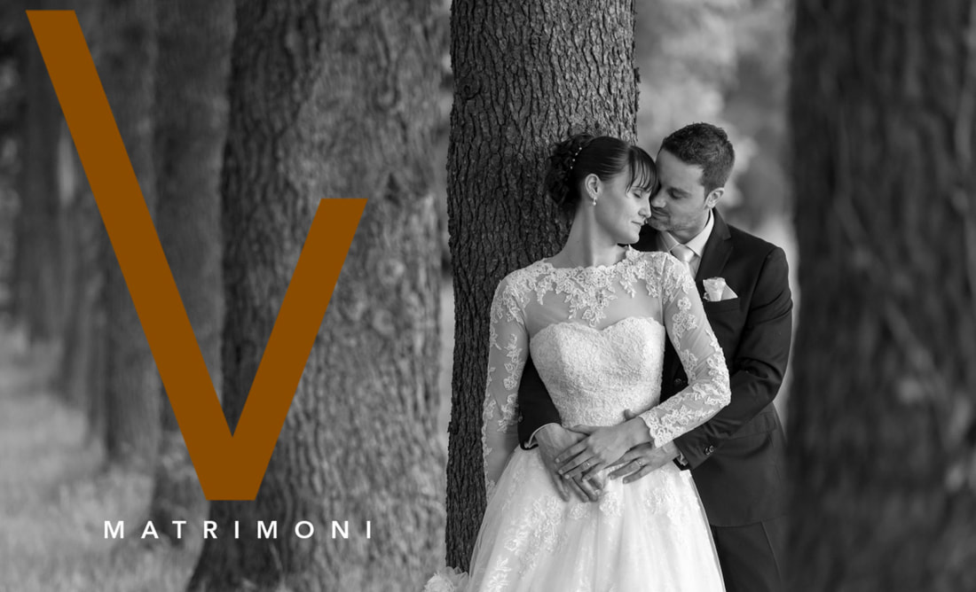
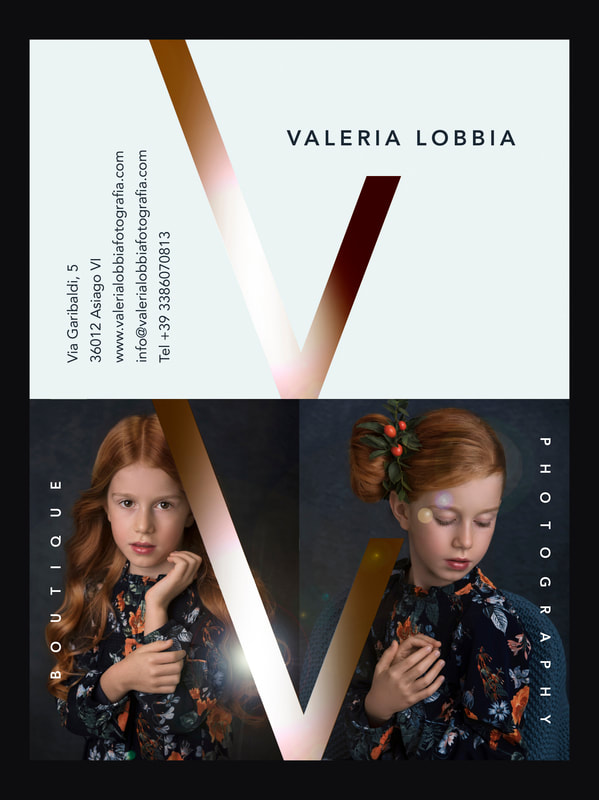
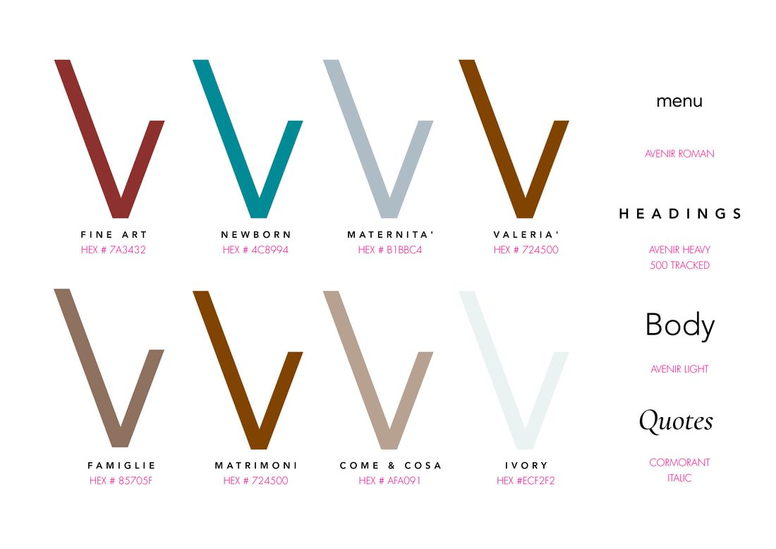
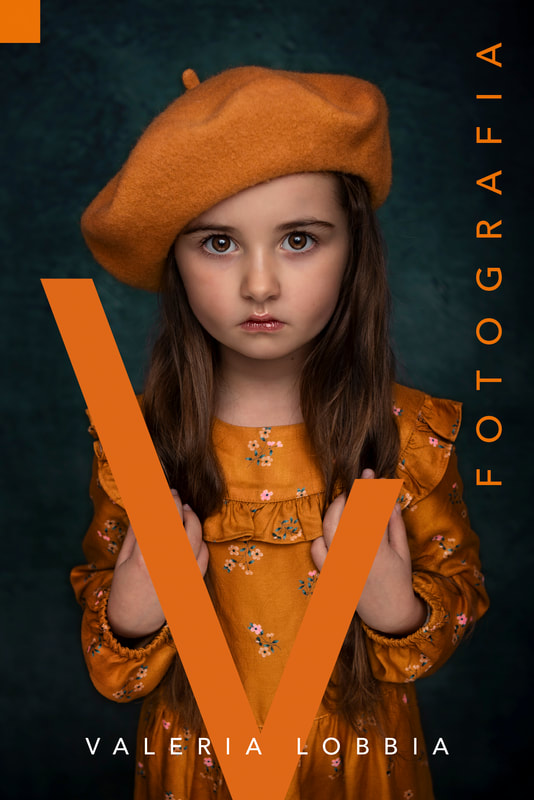
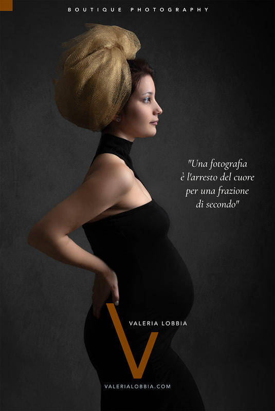
Reducing her name to an almost abstract V transformed Valeria from a name to a brand. Discrete support lines for BOUTIQUE PHOTOGRAPHY reinforced the scale of the brand V, whilst subdued colours prevented the super-sized typography from dominating. The sweet spot of the identity had to be a tension between image, type, crop and colour to make something that held the attention. We wanted the gigantic V to act as a frame, fixing the attention back to the subject’s expression.
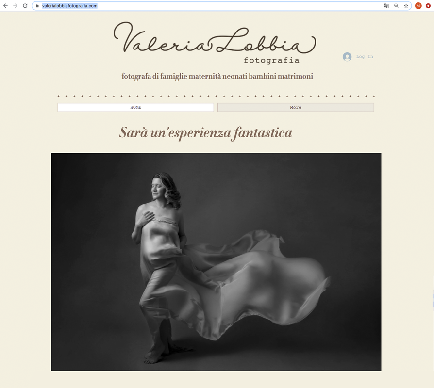
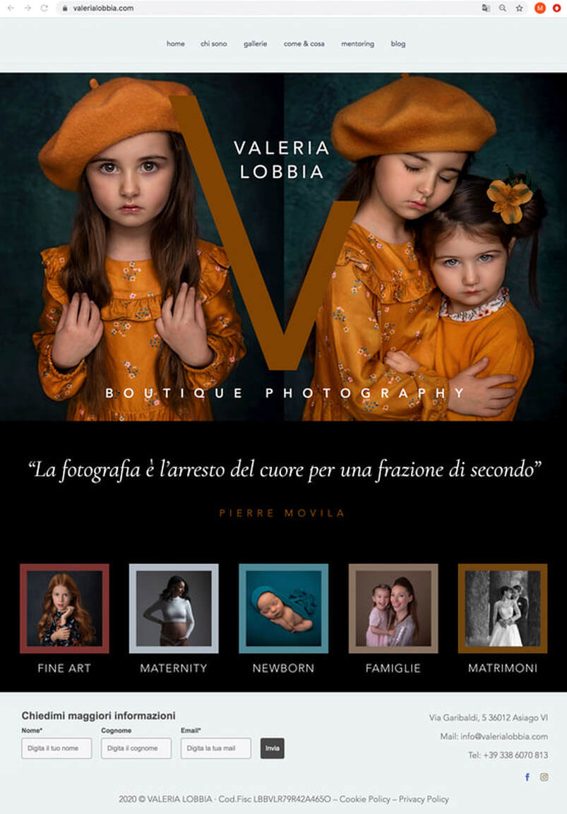
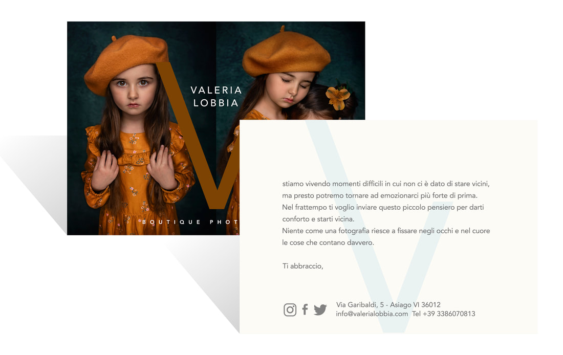
For the website, Valeria’s powerful diptychs became the skeleton against which we presented her new branding and framed her work. At every opportunity we made her photographs as large as possible, ignoring conventional galleries in favour of carefully designed, cascading pages. Instead of regular text-based navigation, we used colour coded thumbnails for each category. These carefully chosen images invited visitors to explore further, with the homepage leading to five more galleries that were just as impactful and carefully laid out.
Each of the sub category pages echoed the homepage design, with diptych structures and evocative accompanying quotes encouraging the eye to travel down. The site was built to be perfectly functional on mobile, but we leaned hard into making a superior laptop experience.
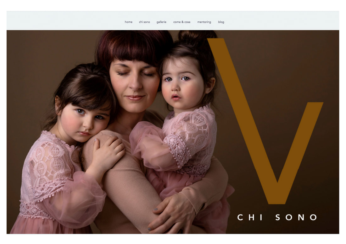
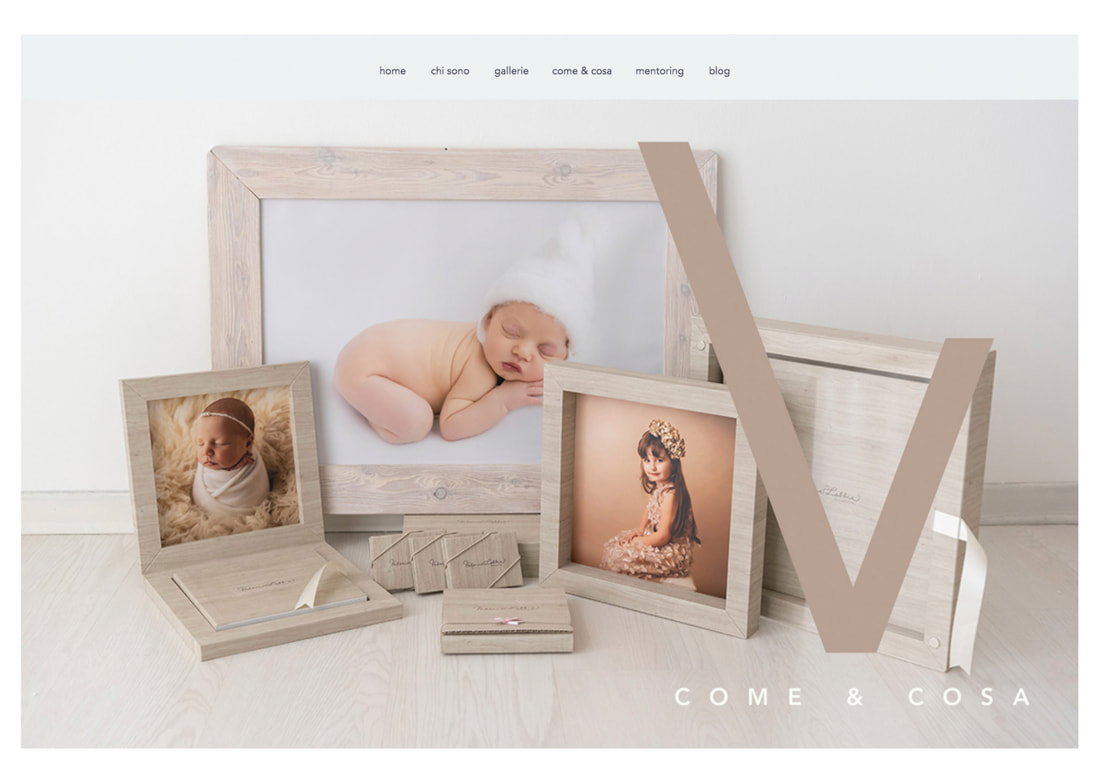
Additional pages were made for Valeria’s superior product range and bio page. How could we not use that beautiful photograph of the photographer herself and her children?
Business cards were designed to be as distinctive and luxurious as her photography, with heavy card weight and expensive foiling.
And then the branding was applied to all of Valeria’s assets, watermarks and social media.
We drew attention to Valeria’s imminent re-launch with a series of short, simple videos that teased her branding but focused on the photography itself.
Deluxe, large format art cards were sent to Valeria’s existing client database, reminding them of her past shoots and revealing her new work and branding. In photography, as with many businesses, past clients are often the best future clients.
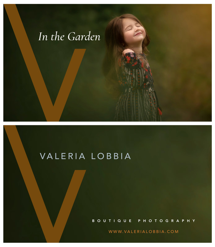
With an easing off of lockdown restrictions, Valeria had the great idea of launching ‘In The Garden’ photoshoots. A great new product to advertise at the same time as her relaunch, we designed title and endcards for the video adverts.
Another important stream of revenue in Valeria’s professional portfolio were her popular training packages, available to buy from her website, which we re-skinned and re-promoted through social media.
Finally, advertising boards that Valeria already had on display in the maternity wing of a local hospital were redesigned to show her new look.
As the rebrand approached completion, Valeria invited us to redesign her new studio as a conclusive step in her creative transformation. Look out for an updated case study in the next few weeks, where Valeria's new interior design will be revealed.