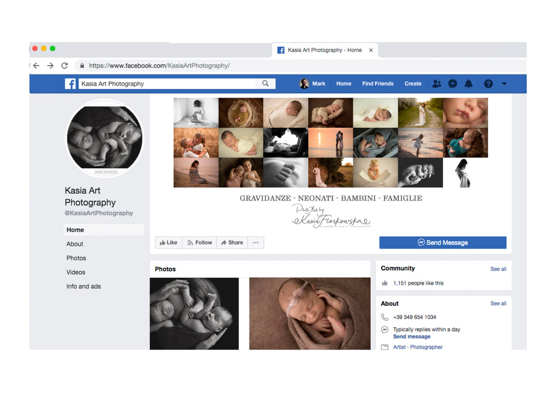
Despite only promoting herself through facebook, Kasia’s stunning newborn and maternity photography had already earned her an enviable reputation.
She came to us looking for a rebrand as she felt her current identity didn’t accurately represent her portfolio. 
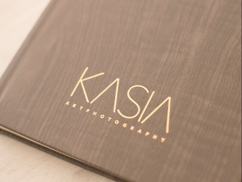
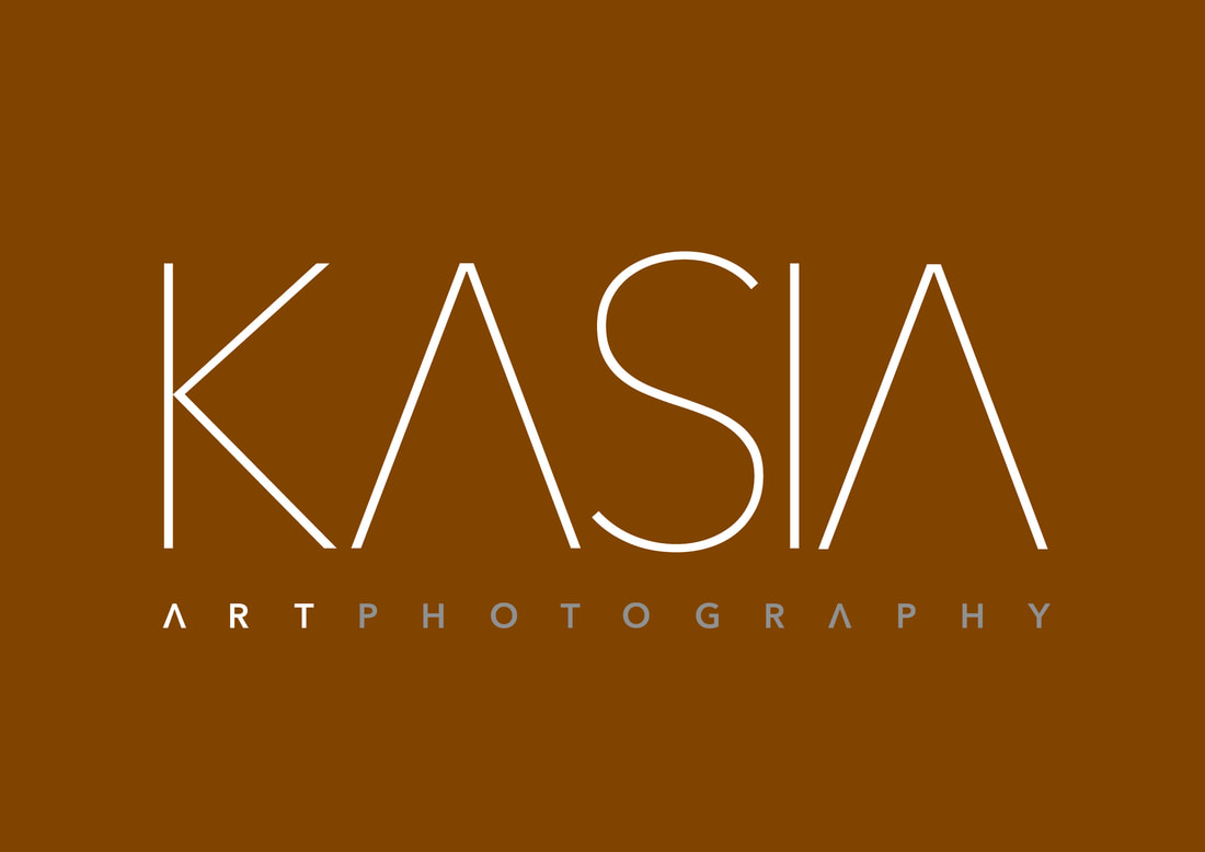
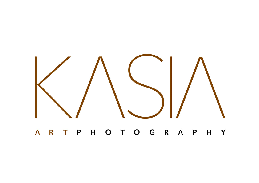
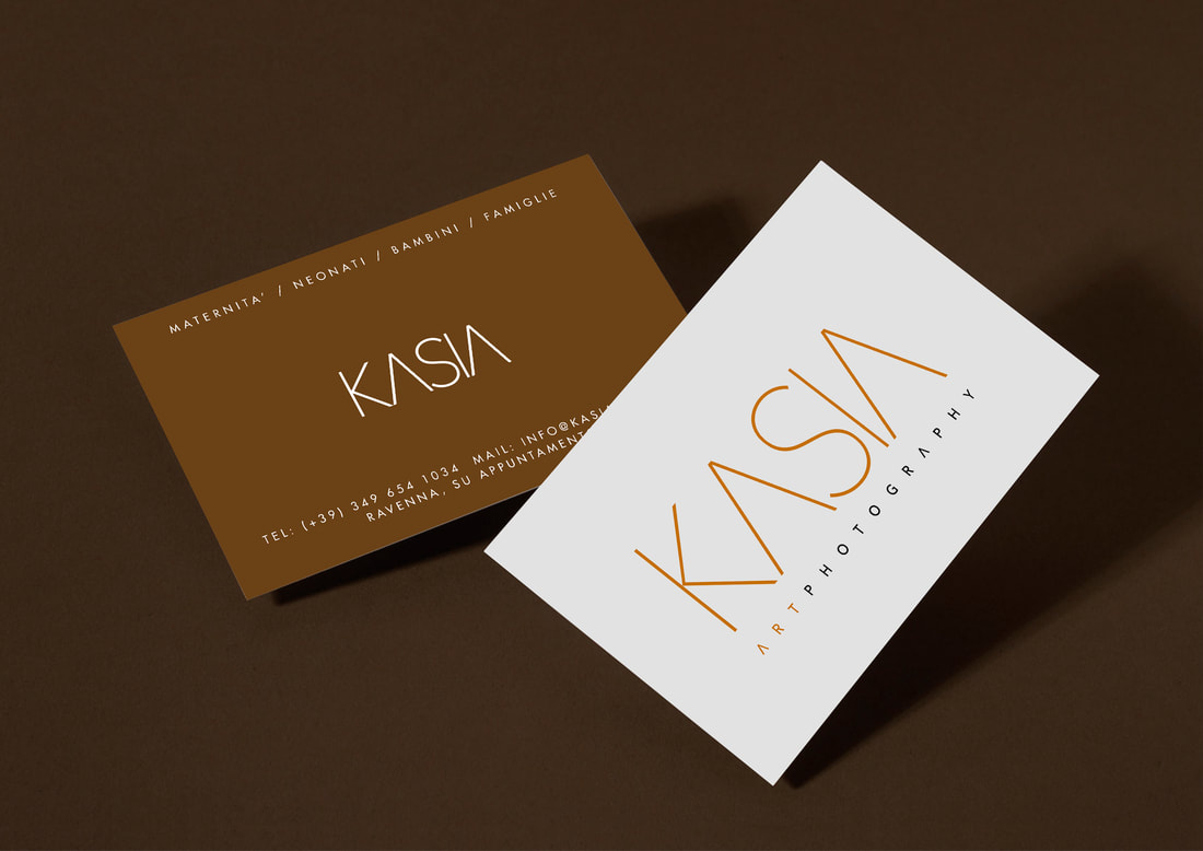
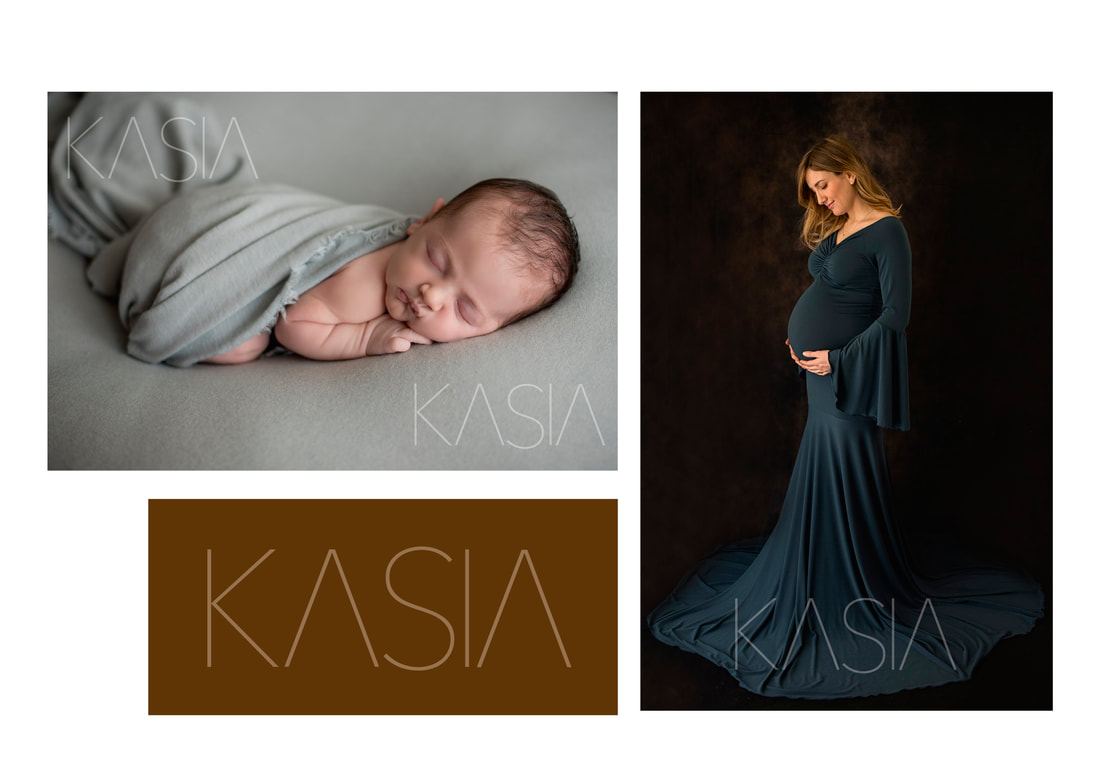
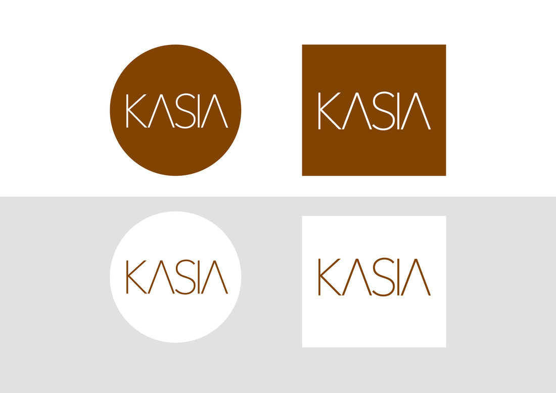
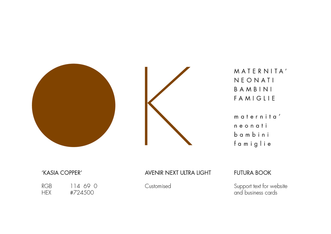
For her new logo, we chose an ultra-light weight of Avenir Next, removing the horizontal stems of the letter A to draw attention to the As of ART and KASIA. Simplifying this already clean font perfectly suited Kasia’s aesthetic, nudging her name towards logo rather than just type whilst retaining legibility. We chose a deep copper brown to echo Kasia’s palette of rich autumnal colours, with a matching foil to be deployed on printed promotional material. Printing with foils is always an expensive option and can easily overpower, but used sparingly (and with different variants to the more obvious gold and silver) it’s unbeatable for suggesting ‘luxury’ in a brand.
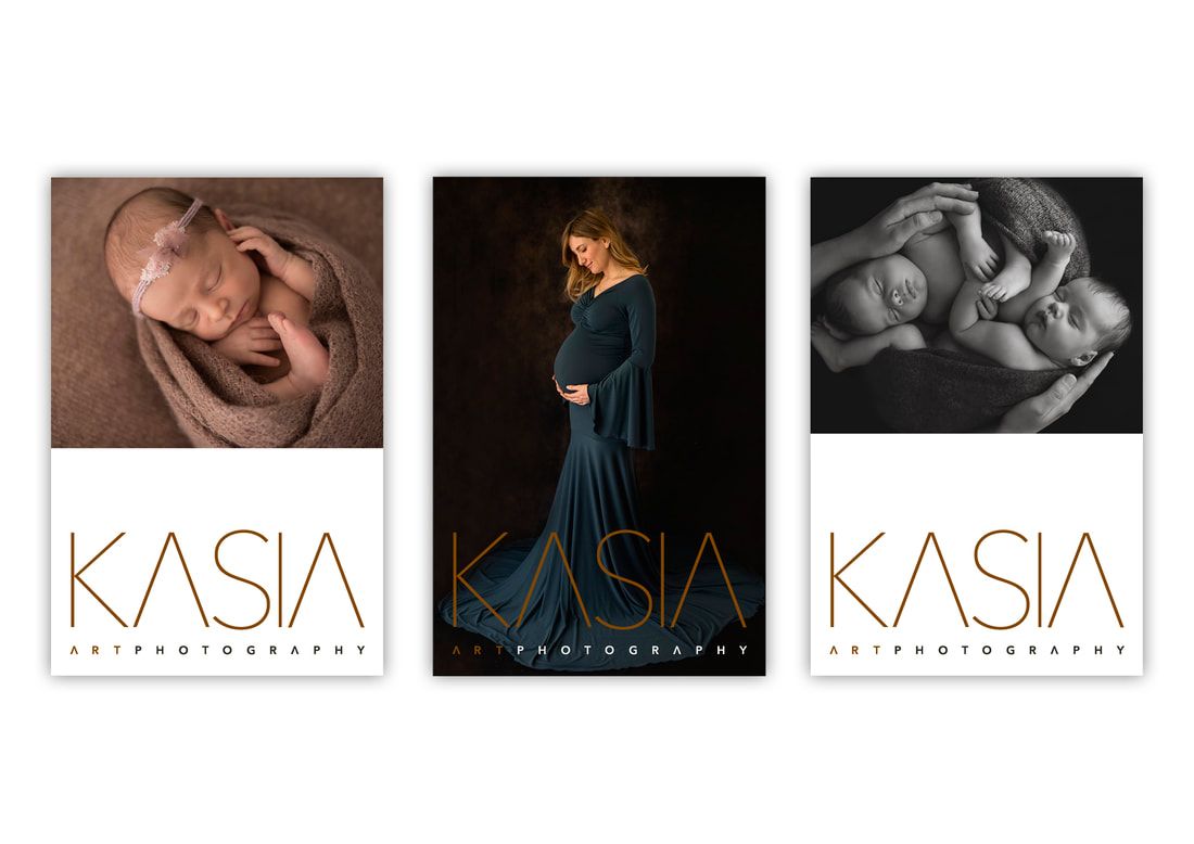
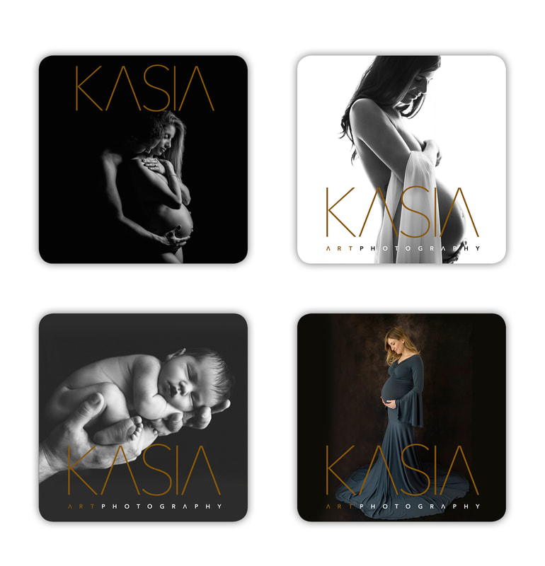
Kasia’s existing promotional art cards were messy and confused. Like most creatives, Kasia found self-editing difficult, so a crucial part of the rebranding process was identifying what made her work so unique.
Sophisticated, elegant minimalism defined her photography, but her art cards were overwhelming and unfocused... 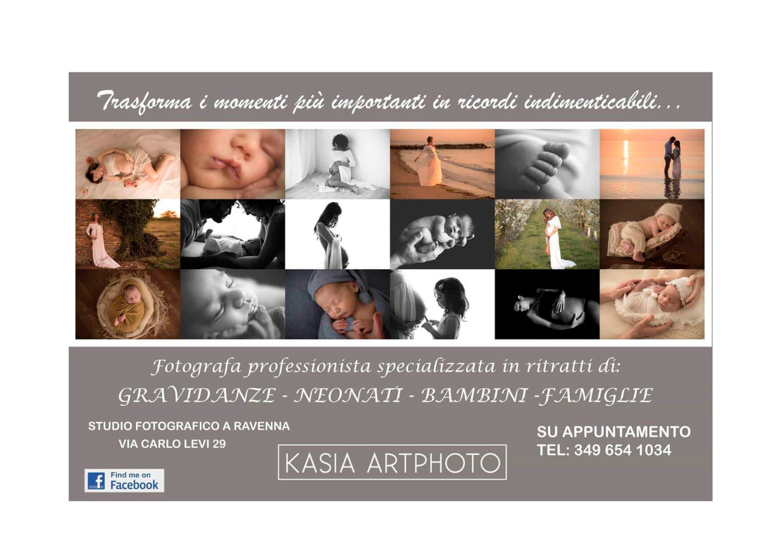
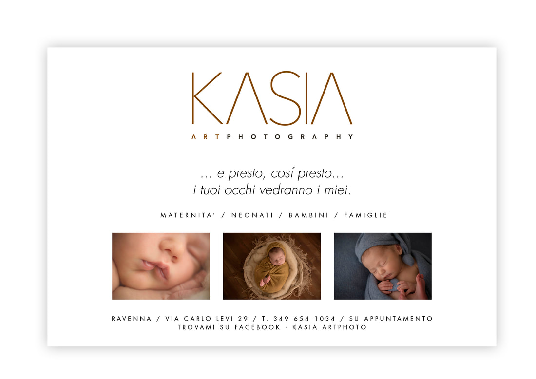
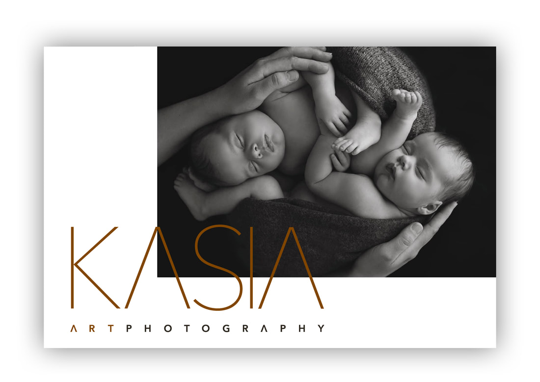
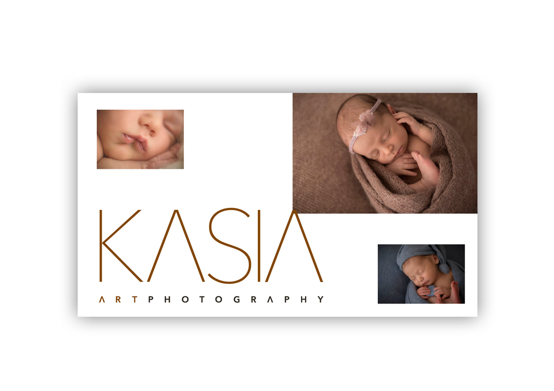
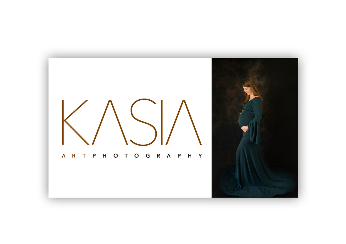
We stripped the number of images right down, so that just three key photos had room to breathe. The large logo and heavily tracked text all shared an art gallery aesthetic, and there was no longer any ambiguity about who the card was by or what she did. On the reverse, we had four different designs, each one focusing on a different photograph at a much larger scale.
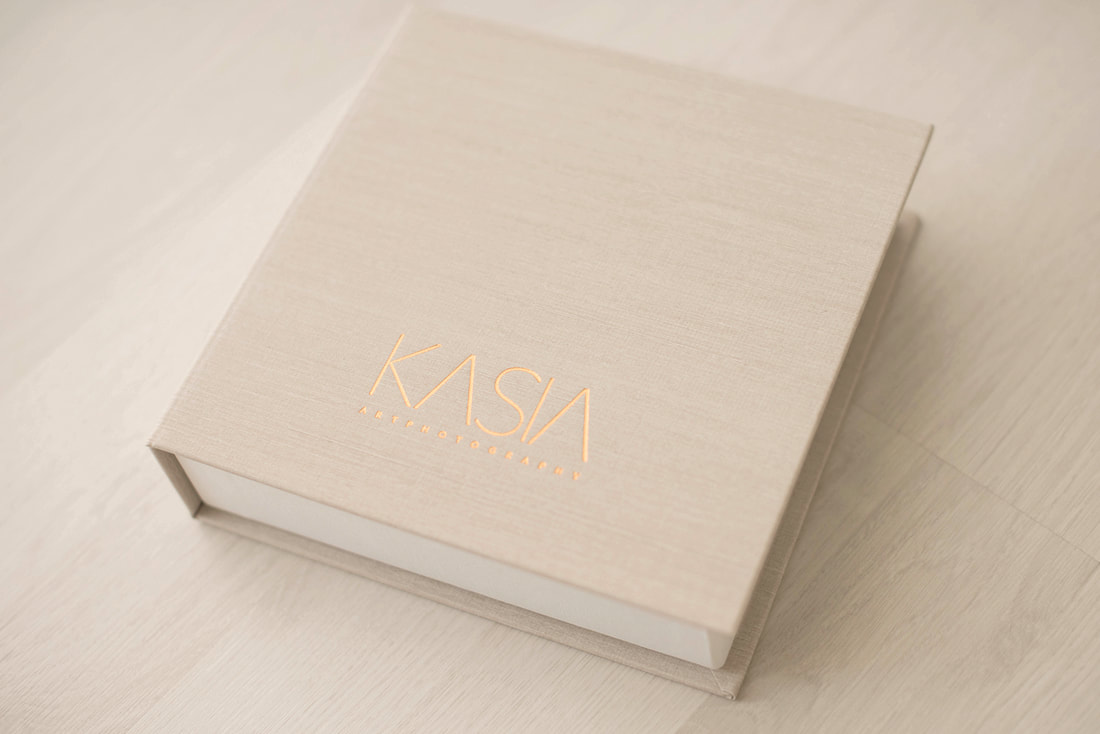
Branding is much more than just logo design. It’s about how your images, use of language and quality of materials all co-exist to form a seamless identity. With this visual language in place, your work will always be immediately recognisable, and just as importantly, instead of each new creative being a time consuming struggle, an easy-to-follow playbook makes the solution obvious. The principles of type, space and materials were applied to Kasia’s business card to make it as luxurious and inviting as possible.
For her facebook page, we simply followed the same rules of decluttering and refining. In a visual environment as chaotic as facebook, minimalism and simplicity are almost always going to be a welcome relief. By giving Kasia the confidence to show a smaller selection of key work, prospective clients would be given a much more powerful first impression of her.
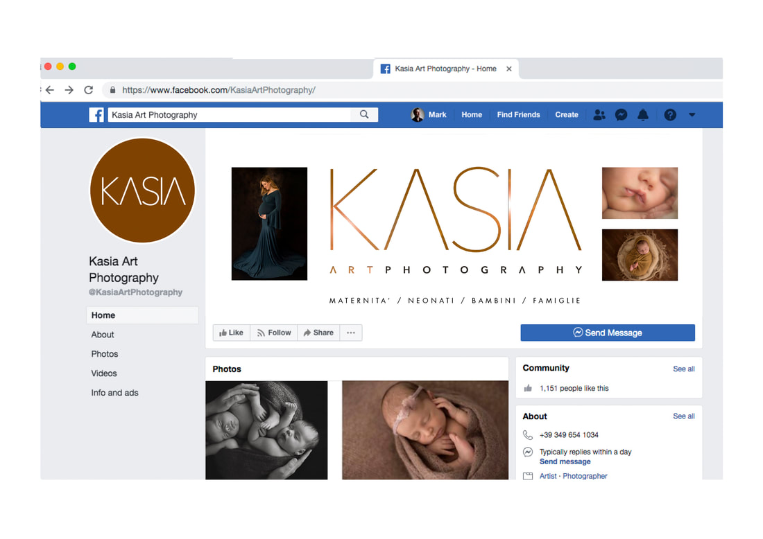
With consistency of tone and execution, Kasia’s branding was then applied to every available touchpoint, from digital watermarks to social media, where powerful single images focused on creating brand awareness rather than volume of work.
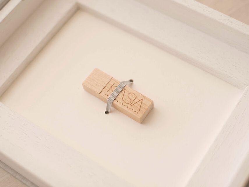
Our finished Playbook – brand rules, style sheets and editable documents – was passed to Kasia so that she could continue branding with total confidence, and she immediately began manufacturing beautiful portfolios and promotional materials that perfectly complimented and enhanced her identity.
The impact of this rebrand was immediate and overwhelming.
“I didn’t believe it when I saw it, but it was mine, I felt it, and it reflected me both as a brand name and a design!” Kasia told us. “I felt like another person and from that moment on I slowly had the strength to do the things I didn’t have before, with amazing results!” Her high-profile rebrand also caught the attention of a journalist selecting ‘best in class’ professionals for a new book, which itself led to even more new projects. “I am making new projects .... a whole series of things that I could never have imagined... the new brand gave me wings! Above all, in the eyes of my customers I am much more appreciated, they trust me, and often the last thing they ask me is the price.” |