Floriane came to us looking for a design strategy that would streamline her product range and upgrade her branding to attract an increasingly sophisticated audience.
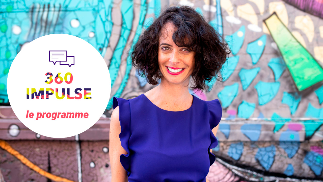
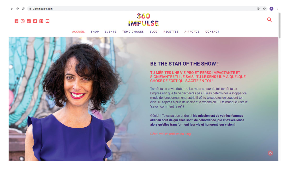
As a coach, mentor, podcaster and popular motivational speaker, Floriane had such a diverse range of products to promote that it was difficult for her to maintain clarity on her website. 360 Impulse and The Flo Show were just two examples of very different products that fought against each other for attention. 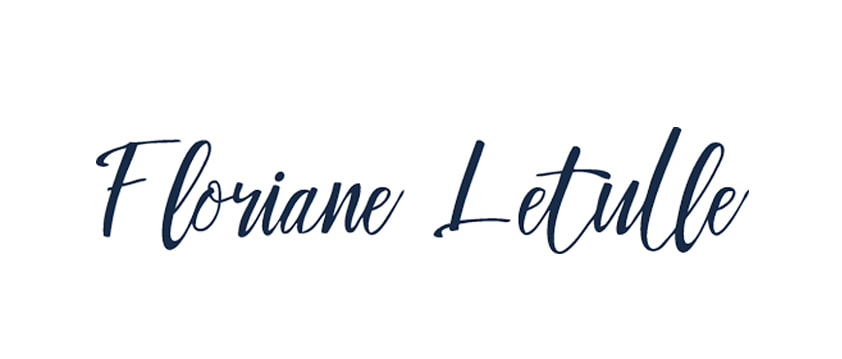
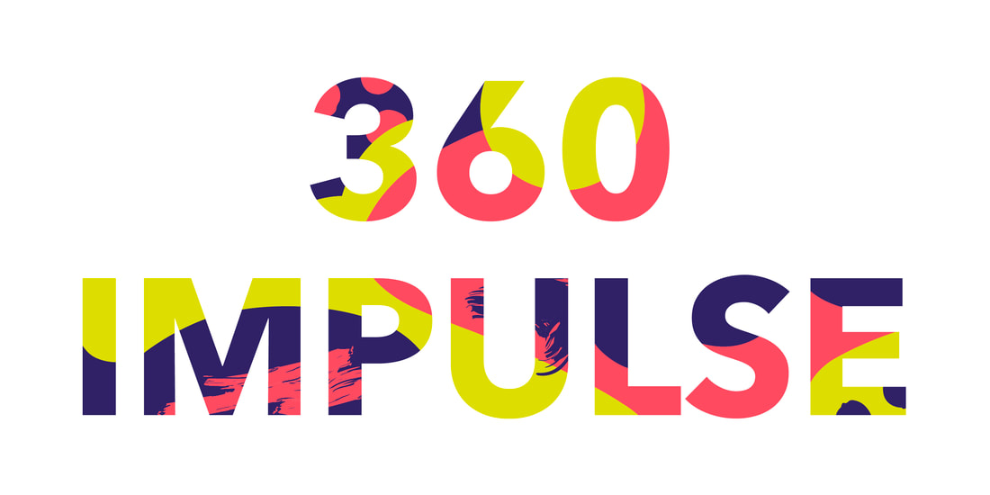
We proposed creating a single new identity that would focus on the key ingredient shared by all Floriane’s products: Floriane. And whilst an important factor of Floriane’s popularity was her irrepressible excitement and diversity – well expressed by her previous branding for 360 Impulse – we wanted the new branding to look more sophisticated. Less lifestyle, more authoritative.
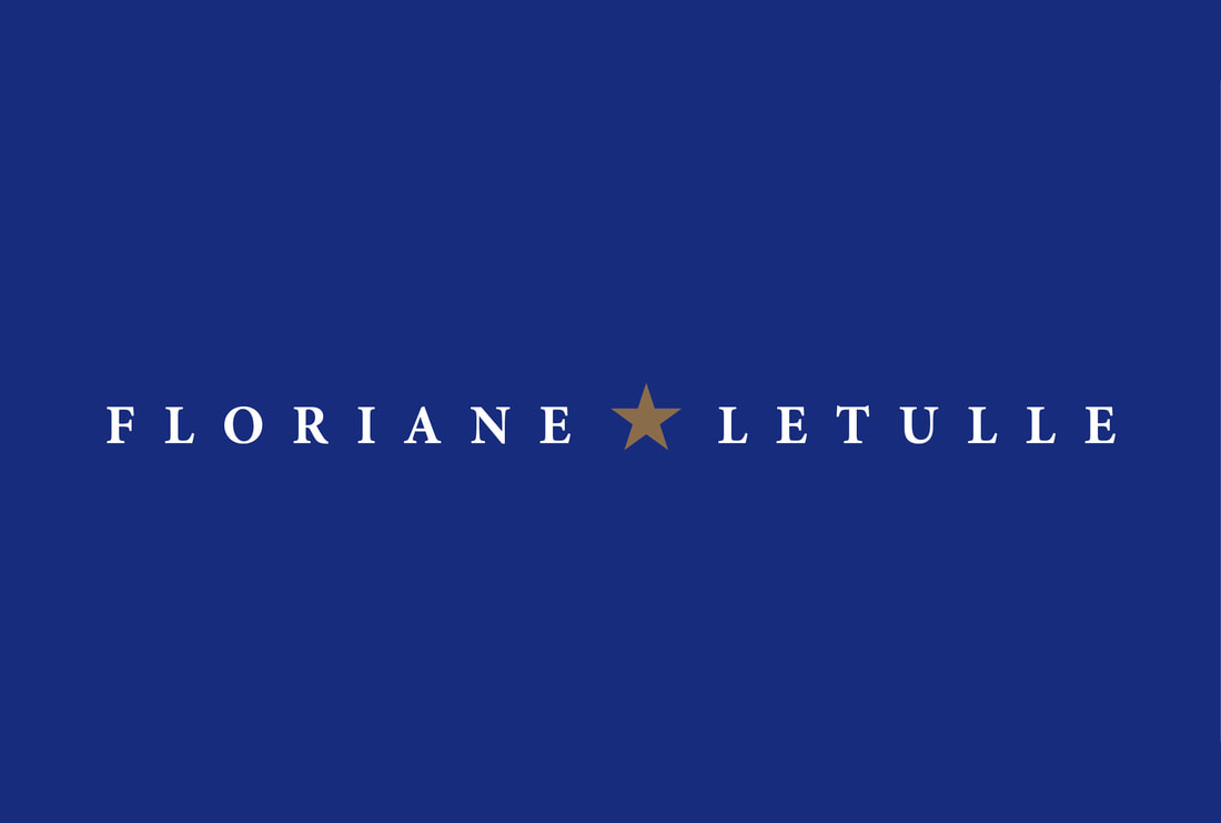
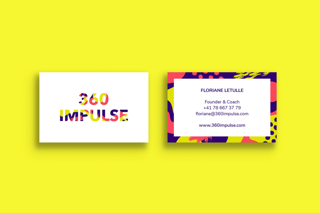
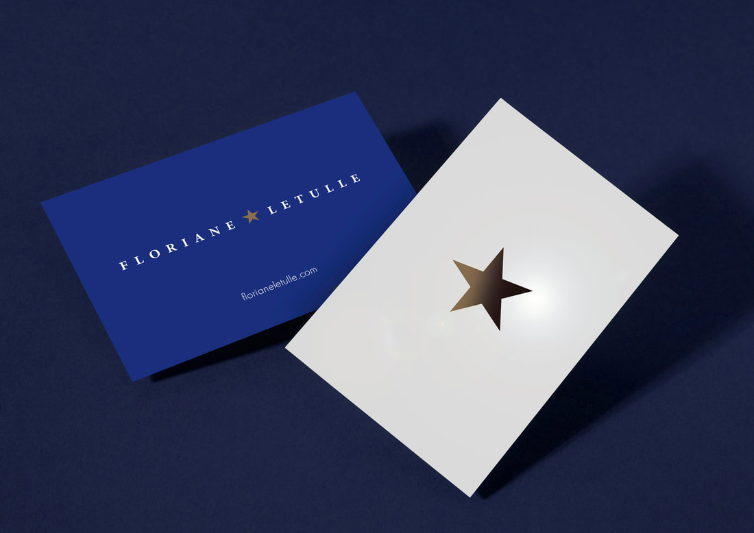
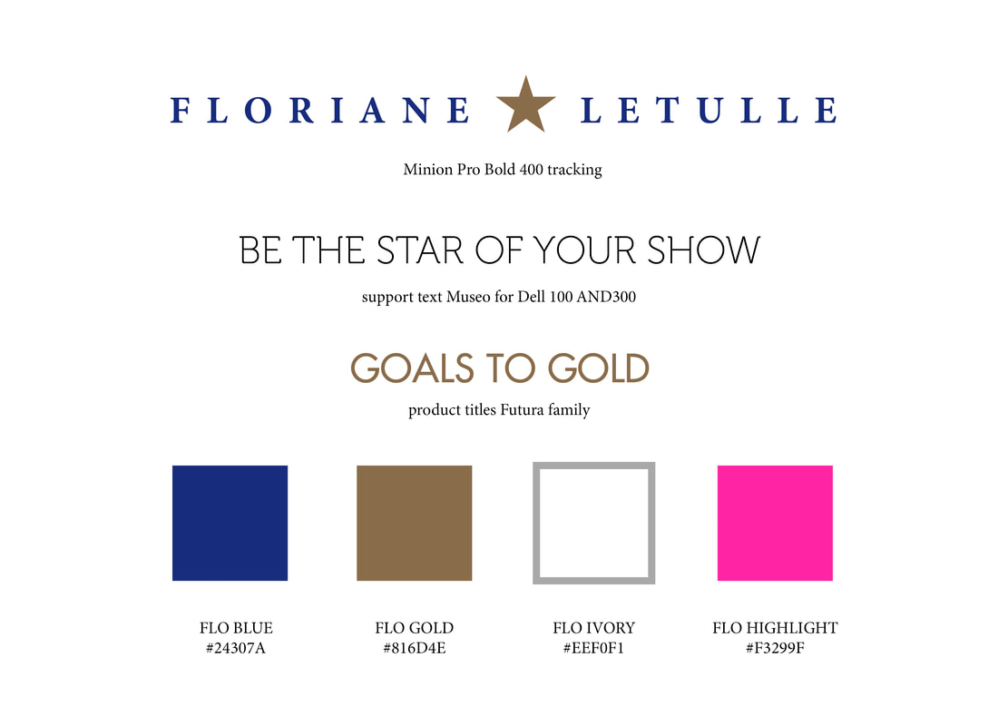
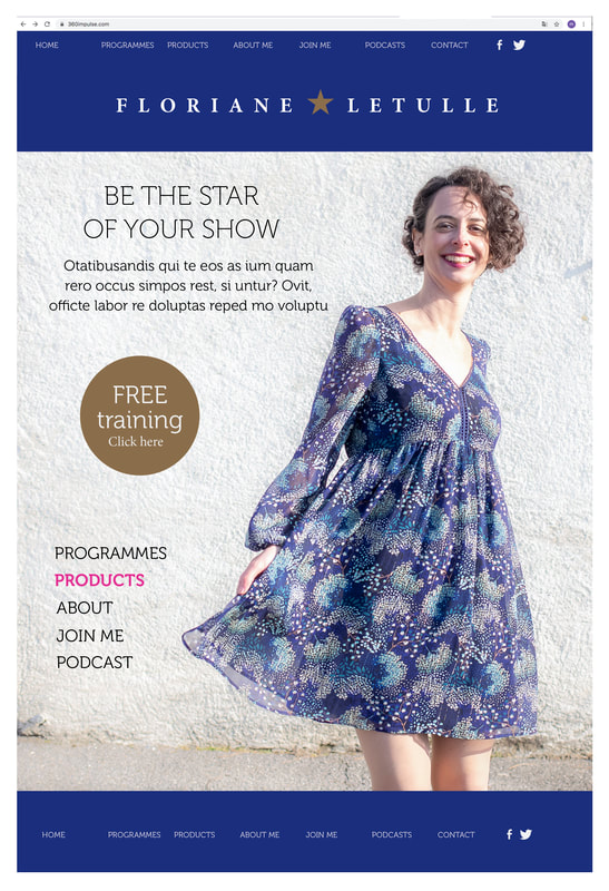
The colour, typography, use of space – even the miniature gold star that referenced her popular ‘Be your own star’ mantra – all channelled a more confident and established identity. The heavily tracked serif font (Minion) set against a deep blue background providing high legibility and non-nonsense tone. It wasn’t Floriane’s products that were changing, but her presentation of them. Her old and new business cards clearly demonstrated the change in tone.
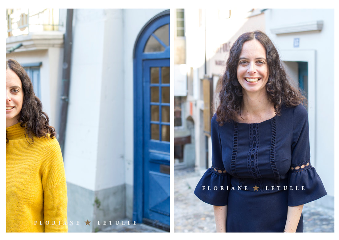
With Floriane’s new graphic identity agreed, we moved onto her overall presentation. As a mentor, the vast majority of Floriane’s images would be photographs of Floriane herself, so it was essential that they reflected Floriane’s new, more sophisticated aesthetic. At present, her photography was as inconsistent in tone as her branding.
We combed through Floriane’s back catalogue of photoshoots to find a selection of photographs we could test the new brand identity on. We needed a visual language that Floriane felt was happy with, and an identity that would hold its own in any context.
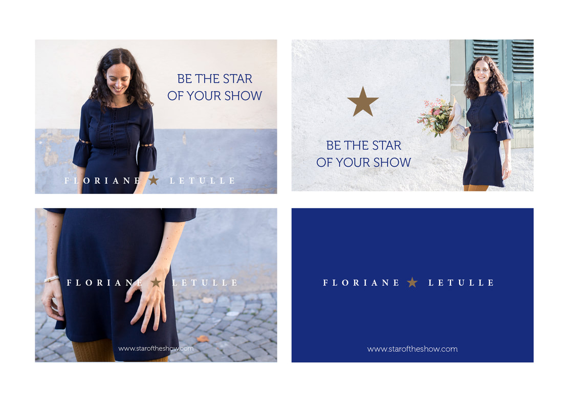
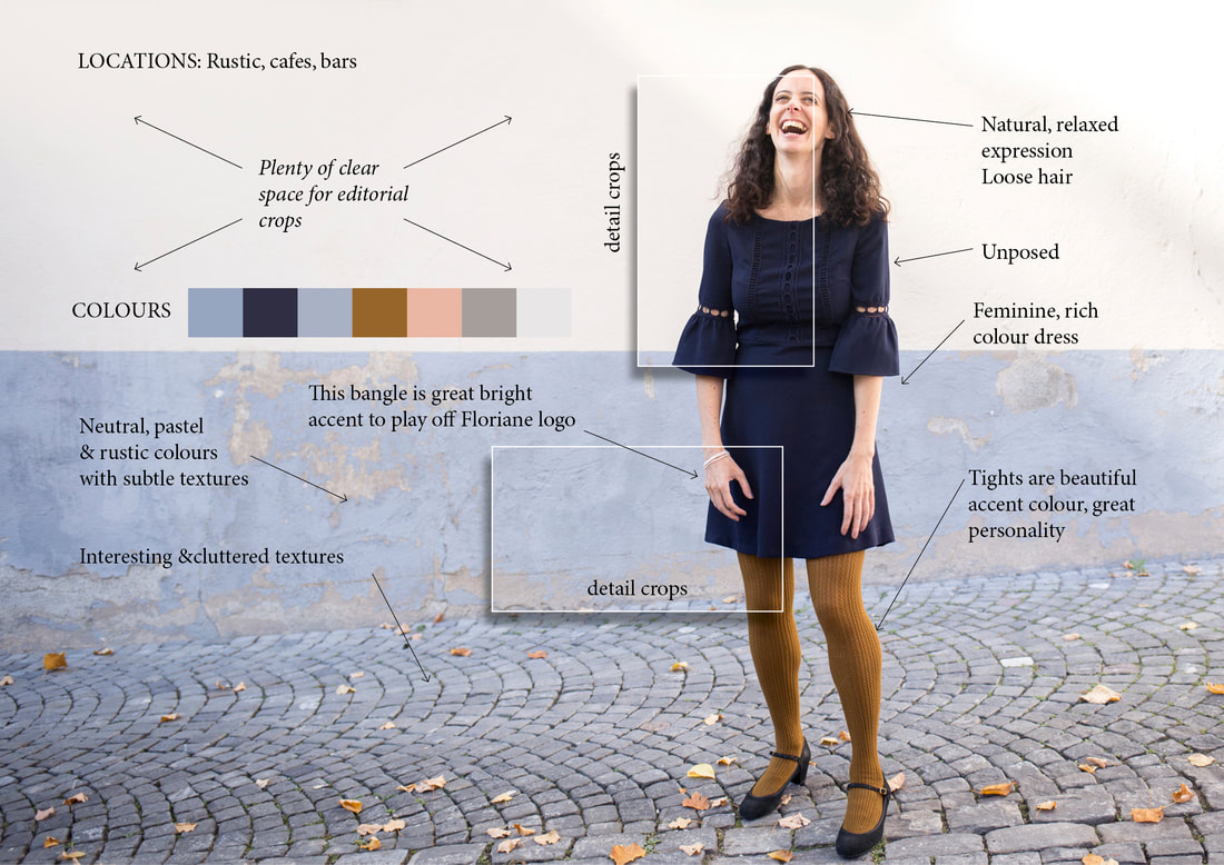
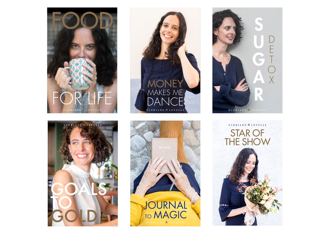
Her website would require a high volume of lifestyle images, so we created a detailed mood board for her to use as in a new, re-launch brand photoshoot...
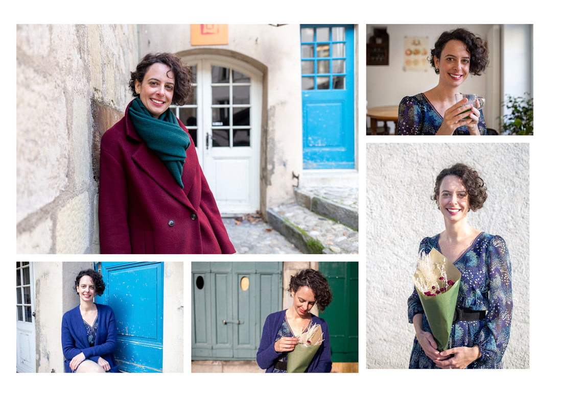
...which we edited down to create a definitive set of editorial photos.
With new graphics, photos, editorial re-focus and clear hierarchy of products, we stripped Floriane’s existing site down to nothing and started again.
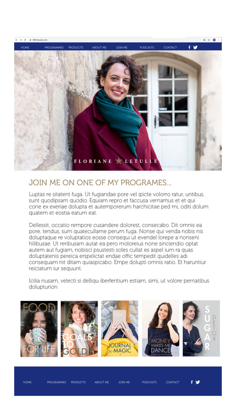
Everything was rebranded, right down to the promotional covers Floriane used to advertise her courses.
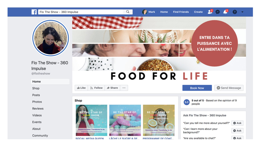
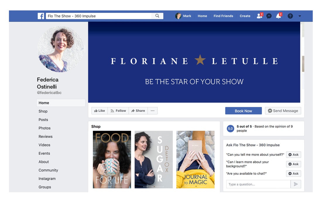
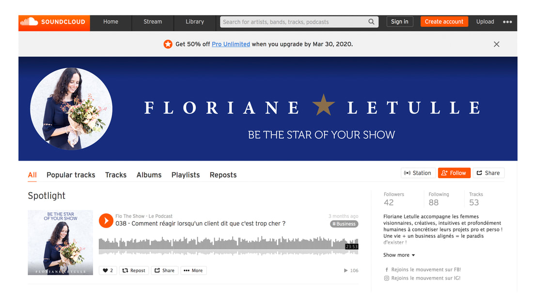
With her website ready to re-launch, we re-skinned Flo’s social media channels, so that wherever clients found her, there was an identical set of brand values. Even facebook, which offers perhaps the most restrictive guidelines for applying brand, can be radically improved with some simple design principles.
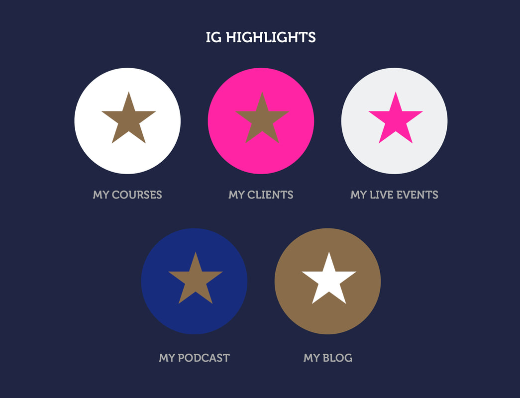
Whilst on instagram, the highlights icons offered a fun opportunity to show the versatility of just one star graphic and four colours.
The more cohesive and focused the identity, the greater the sense of confidence for the client. Visual consistency and tone of voice are the most powerful ways to convince us of a brand’s identity and authenticity. Flo’s simple social media videos didn’t try to explain what she had to offer, but simply communicated her brand values, encouraging the client to discover her for themselves.
|