Over an incredible 47 years, Photo Gek Fenaroli had established themselves as one of Italy’s most flamboyant photo studios.
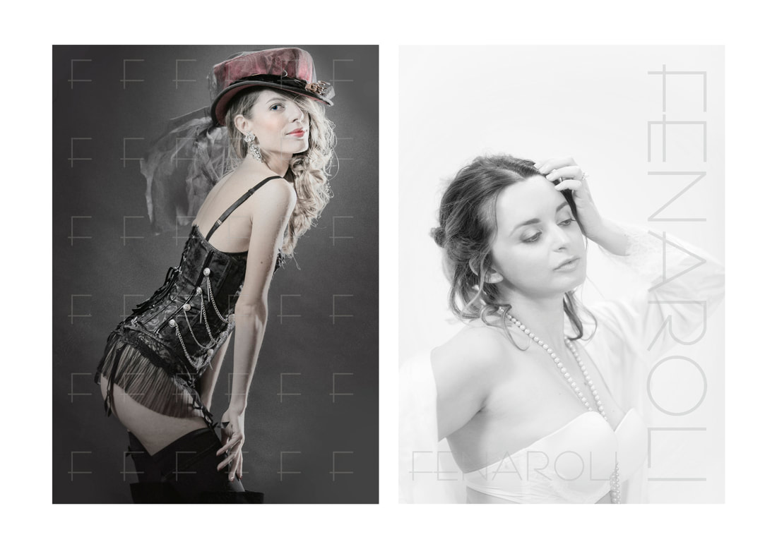
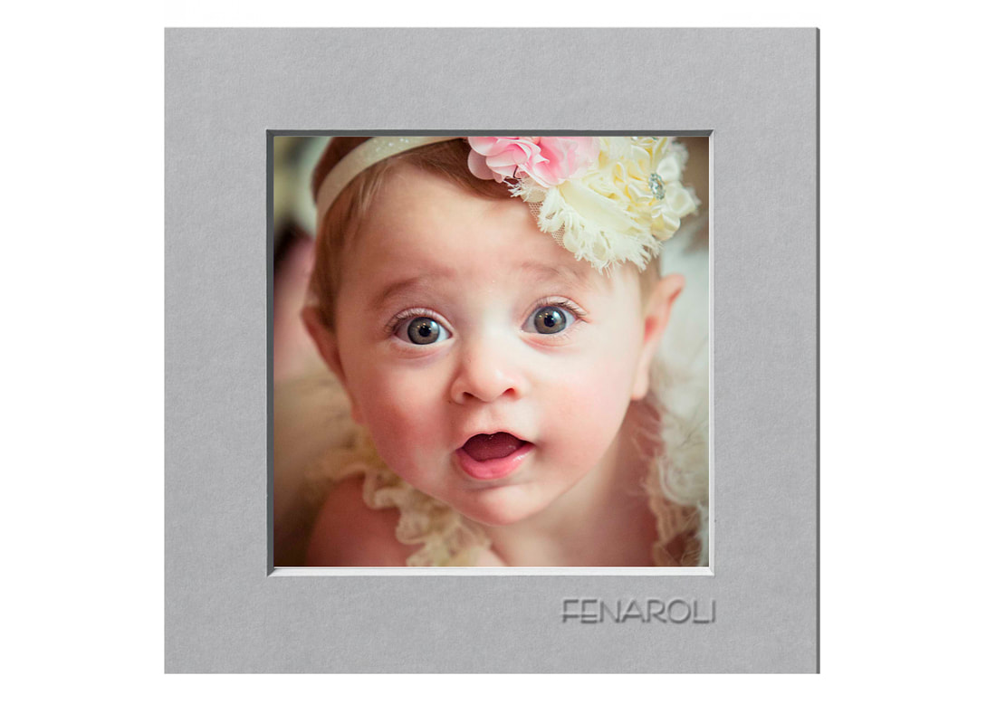
The award-winning family company had a unique theatrical and cinematic flair, and had noticed that alongside traditional wedding and baby photography, newer niches such as boudoir, couples and pets were becoming increasingly popular, led by a growing female client base. A major 9-month rebrand was planned, with the objective of expanding Fenaroli’s appeal without alienating their existing, loyal clients. 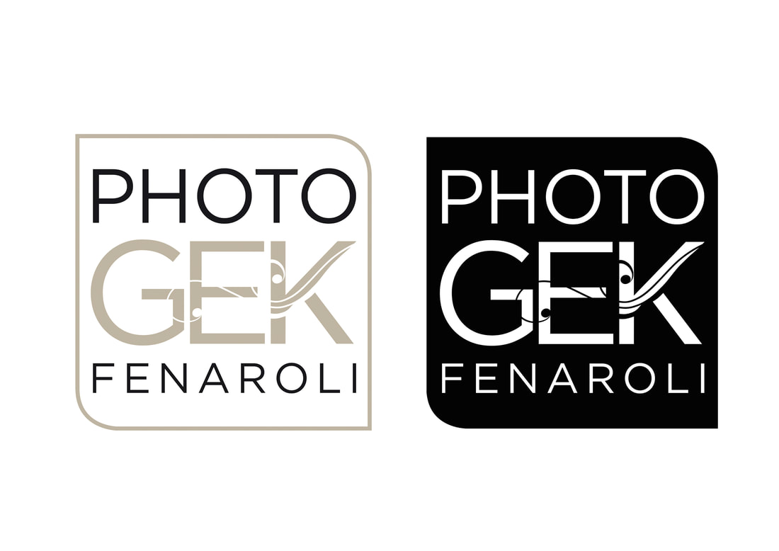
As with any company that had sought to expand and adapt to a fast-changing industry over a long period, Fenaroli had a complex history of visual identities. But after almost fifty years of modest design nips and tucks, their overall identity had become a confusing hybrid of mismatched styles that distracted from their excellent work and left clients confused.
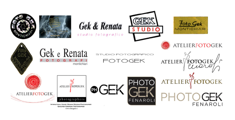
Fenaroli were open to the idea of a redesign that penetrated into the heart of their company and addressed structure and ethos as much as aesthetics. Who were Photo Gek Fenaroli? What were their unique qualities and what was getting in the way of communicating them to clients? The very first question we asked was why "Photo Gek Fenaroli"? The exact wording of their company name had changed almost as many times as their logo, and this rebrand was about clarification and immediacy, so why not simply "Fenaroli"?
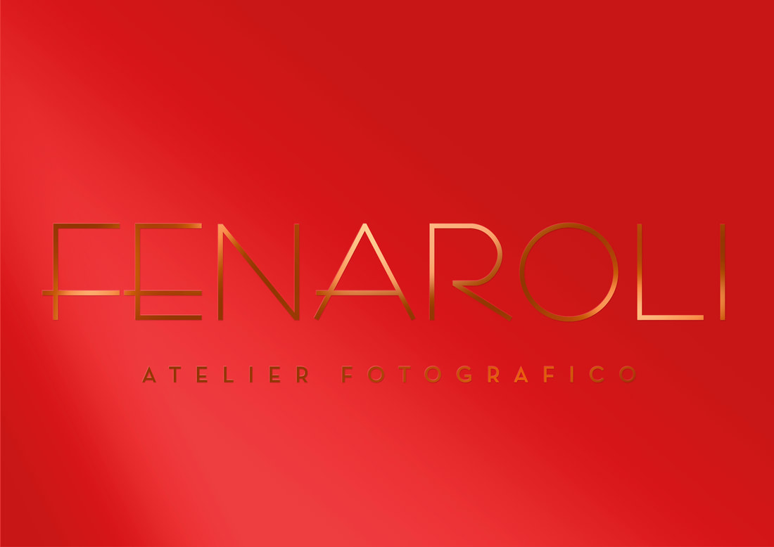
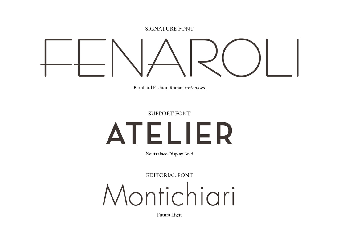
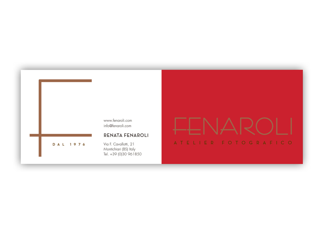
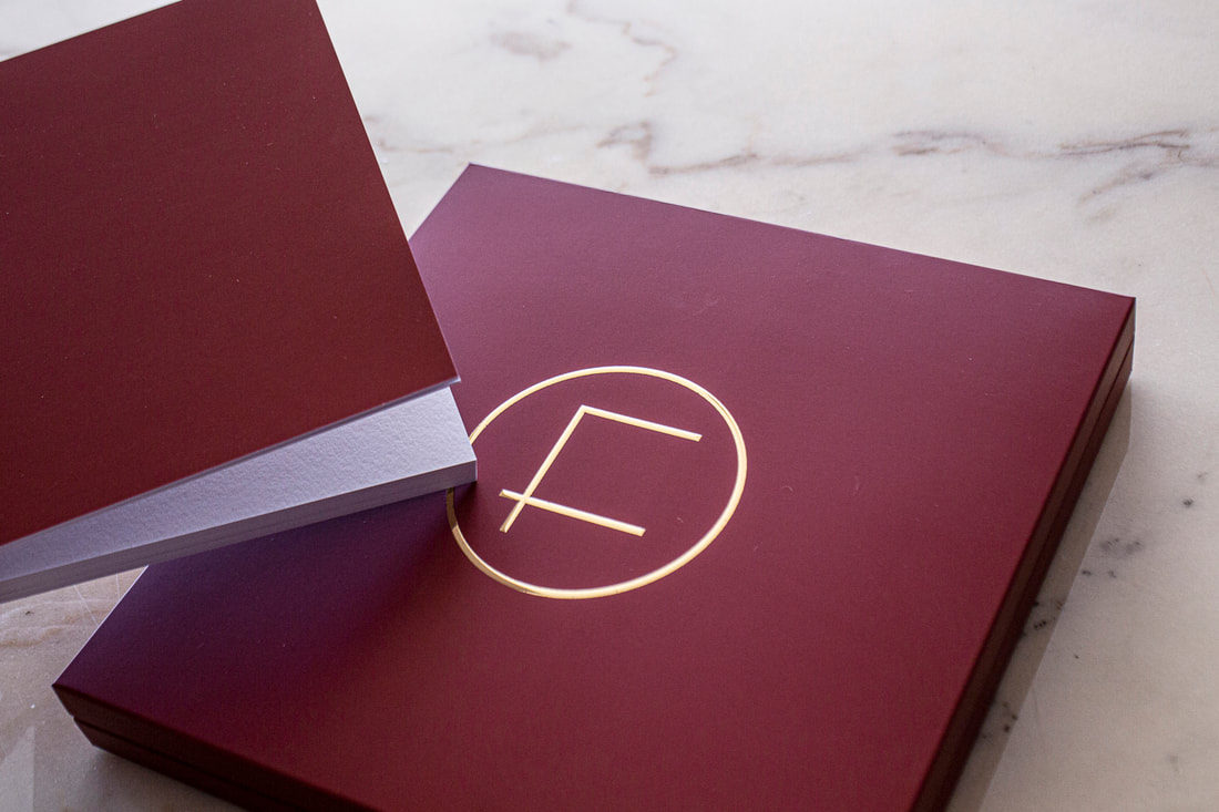
We knew we wanted a theatrical, classic look for Fenaroli, something elegant and sophisticated but also inviting. During our research we came across the wonderful 1929 font, Bernhard Fashion, which had been designed to celebrate the glamour and fashion of the 20s. Set in decadent Art Deco gold against stage curtain inspired red, the new logo made a bold statement of Fenaroli’s intent.
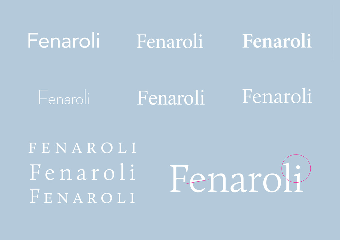
With everyone happy that this was the new Fenaroli, we refined a complete typographical solution...
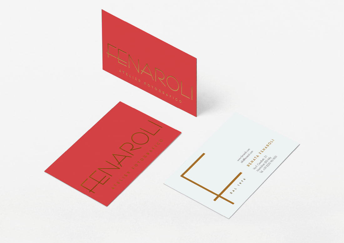
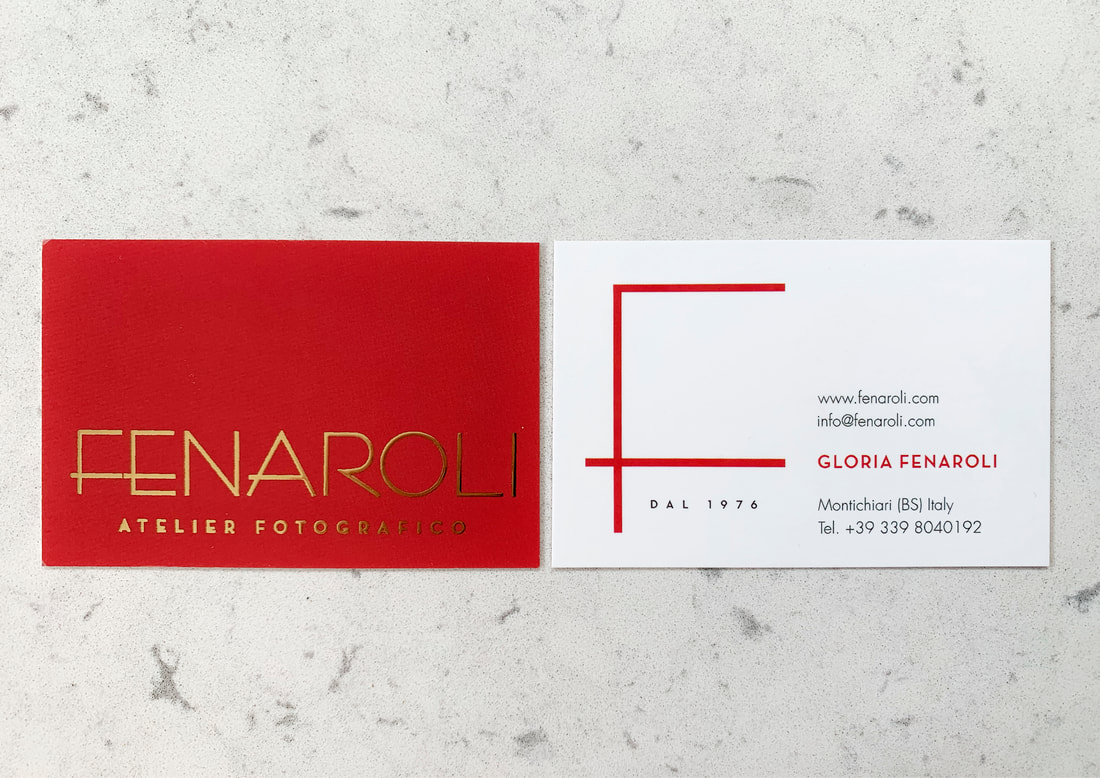
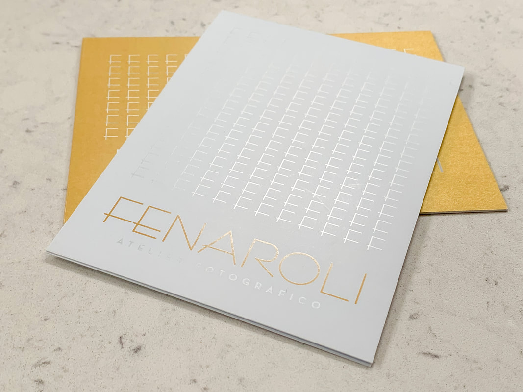
...which was deployed to design and manufacture luxurious, foil-embossed soft touch business cards.
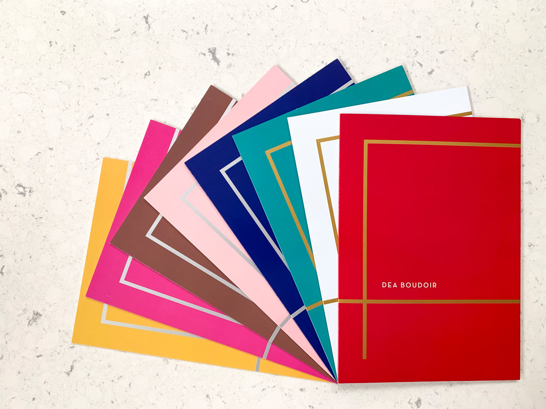
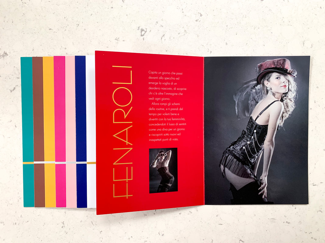
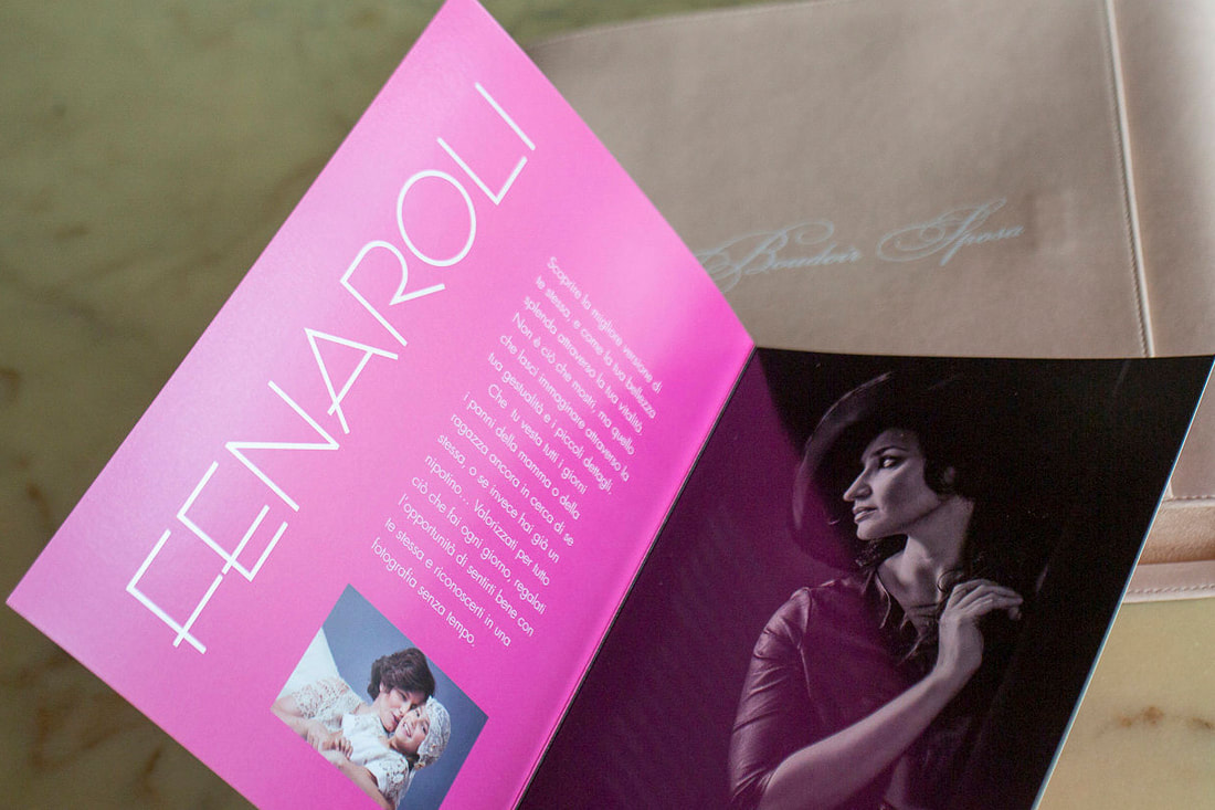
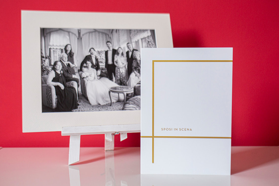
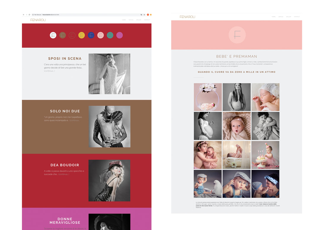
Another crucial ingredient of the rebrand was devising a colour-coded system to identify Fenaroli’s new photography menu. New work was commissioned to provide best-in-class examples of each category, followed by testing sample colours and photography side by side. With these agreed on, we could progress to our most important printed collateral: the photography brochure that would advertise Fenaroli’s work.
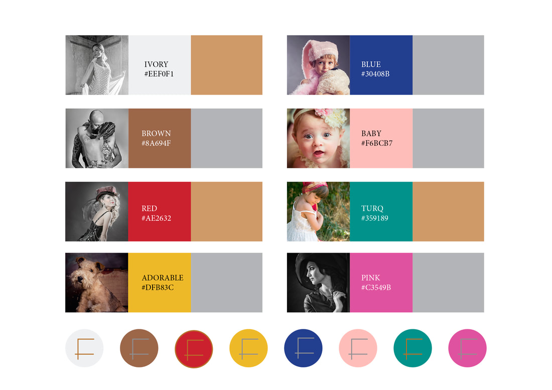
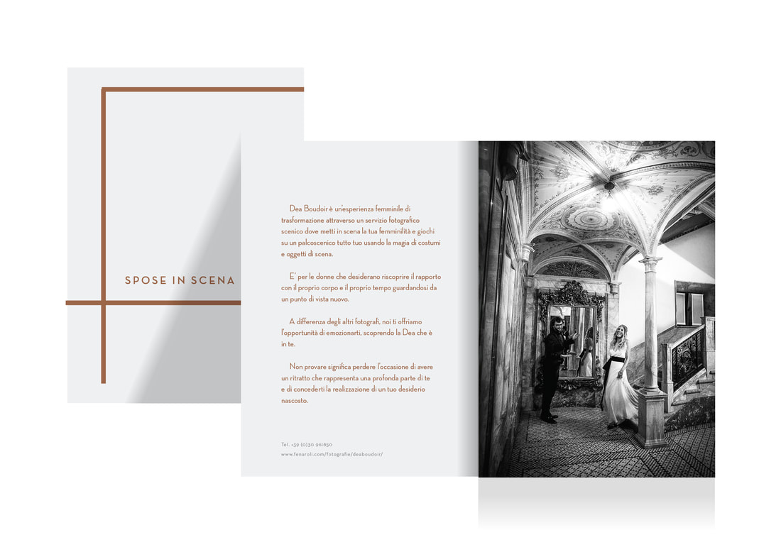
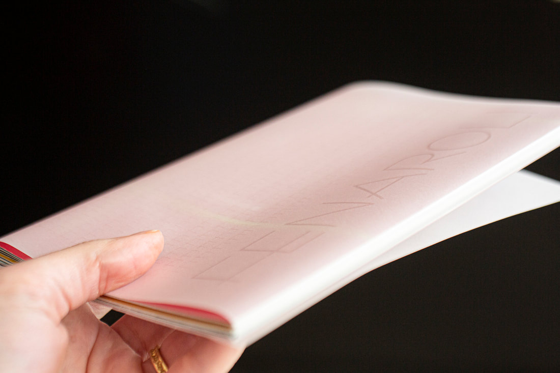
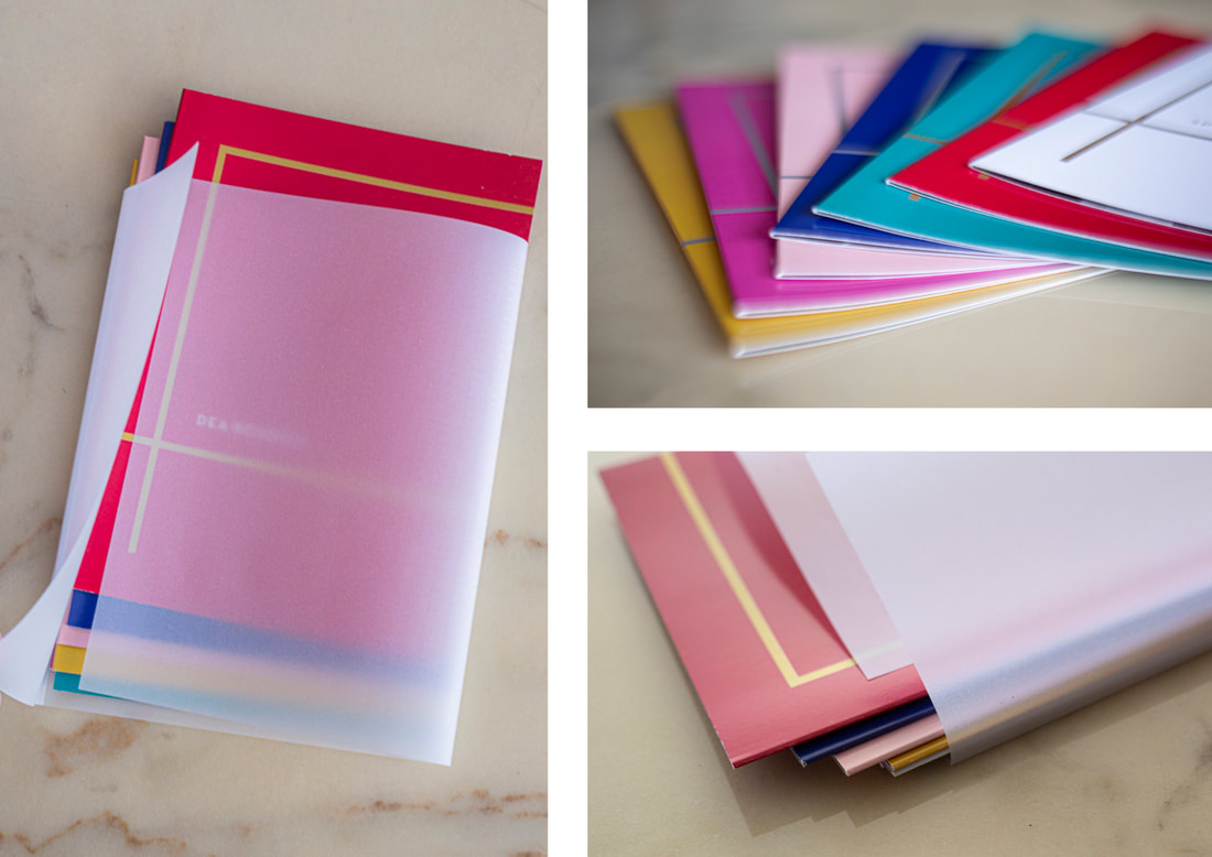
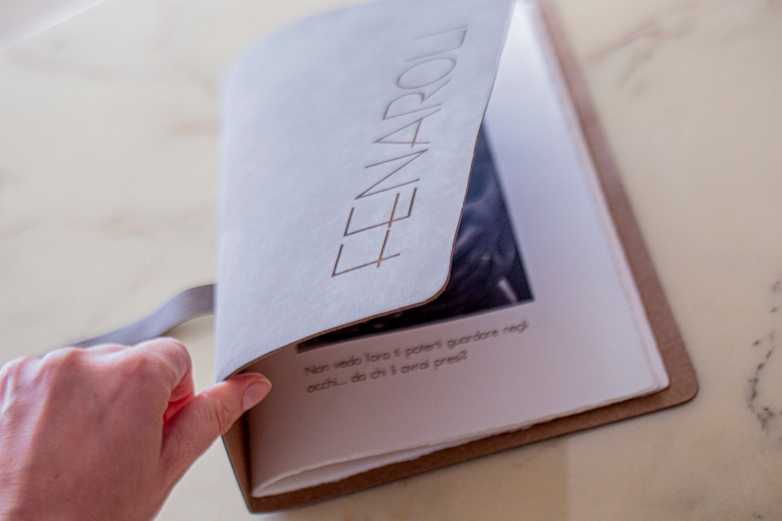
Instead of producing one large booklet divided into categories, we decided to make eight individual brochures that could be given individually to prospective clients based on their preference, bundled inside a semi-opaque sleeve.
These brochures needed to look and feel luxurious, show Fenaroli’s work at its best, draw attention to new categories and reveal their new identity. For many clients these brochures would be the first sight of the rejuvenated Fenaroli, so we spent a lot of time researching materials and finishes and making prototypes for the sleeve. A simpler treatment could turn a basic catalogue into a substantial showcase and a better targeted marketing tool. 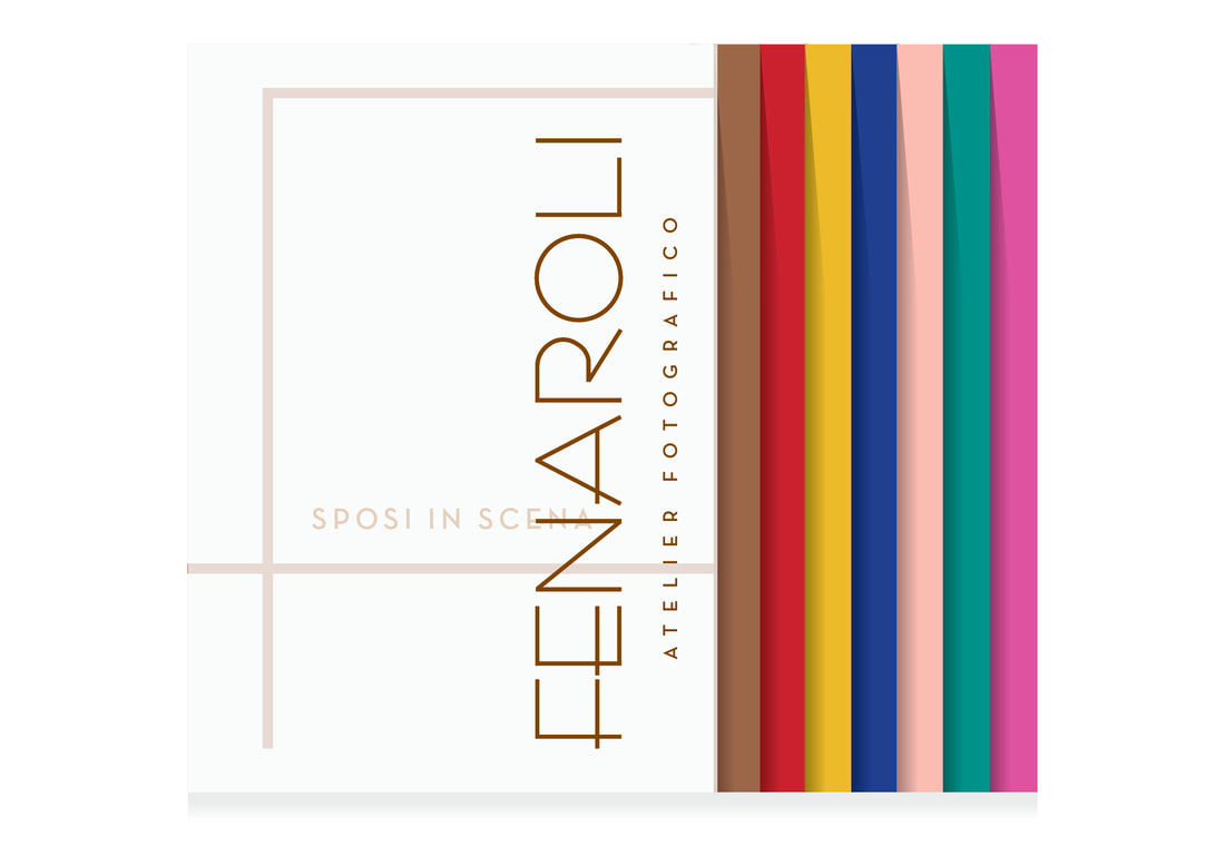

With the format and design approved, we worked with a UK local printer to source the best materials and costs, with the aded advantage that we could refine and adapt the high-spec details (including the opaque metallic inks) with just a simple visit around the corner. Once all the brochures, business cards and event launch materials were printed, our printer shipped them all direct to Italy with us confident that everything would be exactly as the client expected.
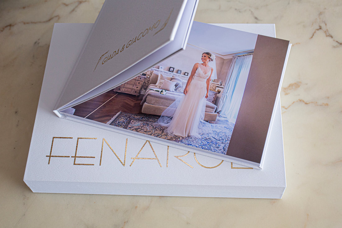
With a luxury brand like Fenaroli, every opportunity to show attention to detail matters: from digital watermarks and embossed cards, to bespoke albums and portfolios manufactured to the highest standards by internationally acclaimed printers Graphistudio.

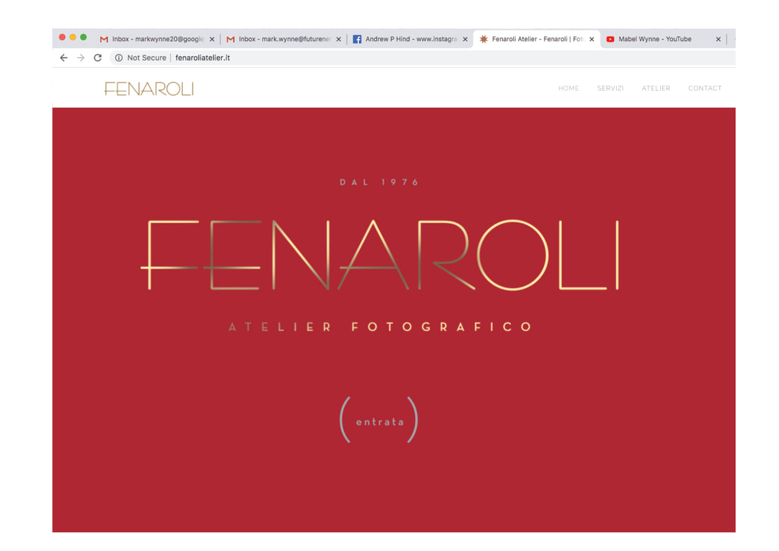
Fenaroli’s website revealed their confused identity. There were too many sections, too much information, too much navigation and no cohesive aesthetic. As with many sites for well established companies, this had been adapted and added to many times over the years and was now confusing. Most importantly, Fenaroli’s photography didn’t take pride of place.
We rebuilt the site from scratch, following the common sense principles already established: show the work and improve client experience. The homepage became a confident flourish designed to suggest dealing with Fenaroli would be a pleasure.
We wanted to seduce clients rather than bombard them with too much information, so we tried to make interaction through the website as intuitive and brisk as possible, with colour coded sections, tighter copy and fewer images. The website needed to use the same visual identity and tone of voice as the brochures – right down to the initial choice of images – so that the Fenaroli experience would be seamless and cohesive for clients.

Instagram and facebook are vital store windows for photographic studios, and Fenaroli had already invested a lot of time in showcasing work and building community awareness across these platforms. We updated their graphics and encouraged a more considered approach to posts. Every image adds or detracts from the company’s brand identity. Every post should be written in the brand's voice.
Brand is about consistency: the client always has to know where they are and who is talking to them. Your brand is your feed history. These platforms are quick and easy to post on, but every time you publish you are adding another small fragment to your total identity: is it consistent with your aesthetics and philosophy? 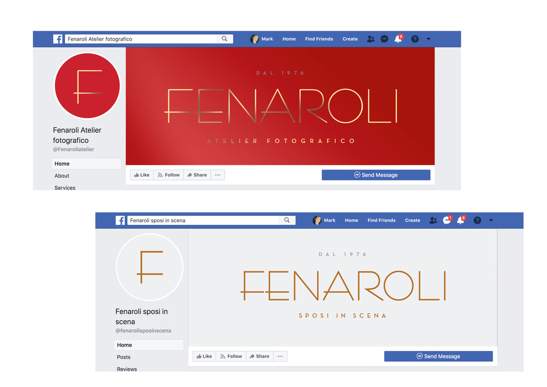
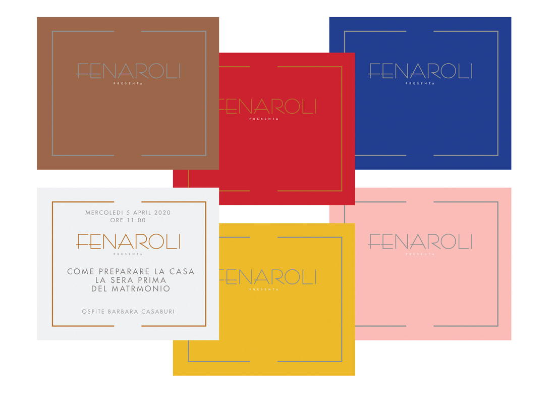
We helped Fenaroli with invites, launch promo vouchers and social media event teasers, planned well in advance so that we could all work to a fixed date. The story behind a redesign can be a powerful focus for press coverage, and sending out all-new brochures with fresh branding to existing clients is as targeted and effective a strategy as is possible.
The Covid-19 lockdown threw Fenaroli’s relaunch party plans out of the window, but with agile thinking they attracted attention in other ways, posting teaser images of their upcoming presentation. Heavy pre- and post-launch social media activity guaranteed that the wider community knew that the rebrand was happening and when. 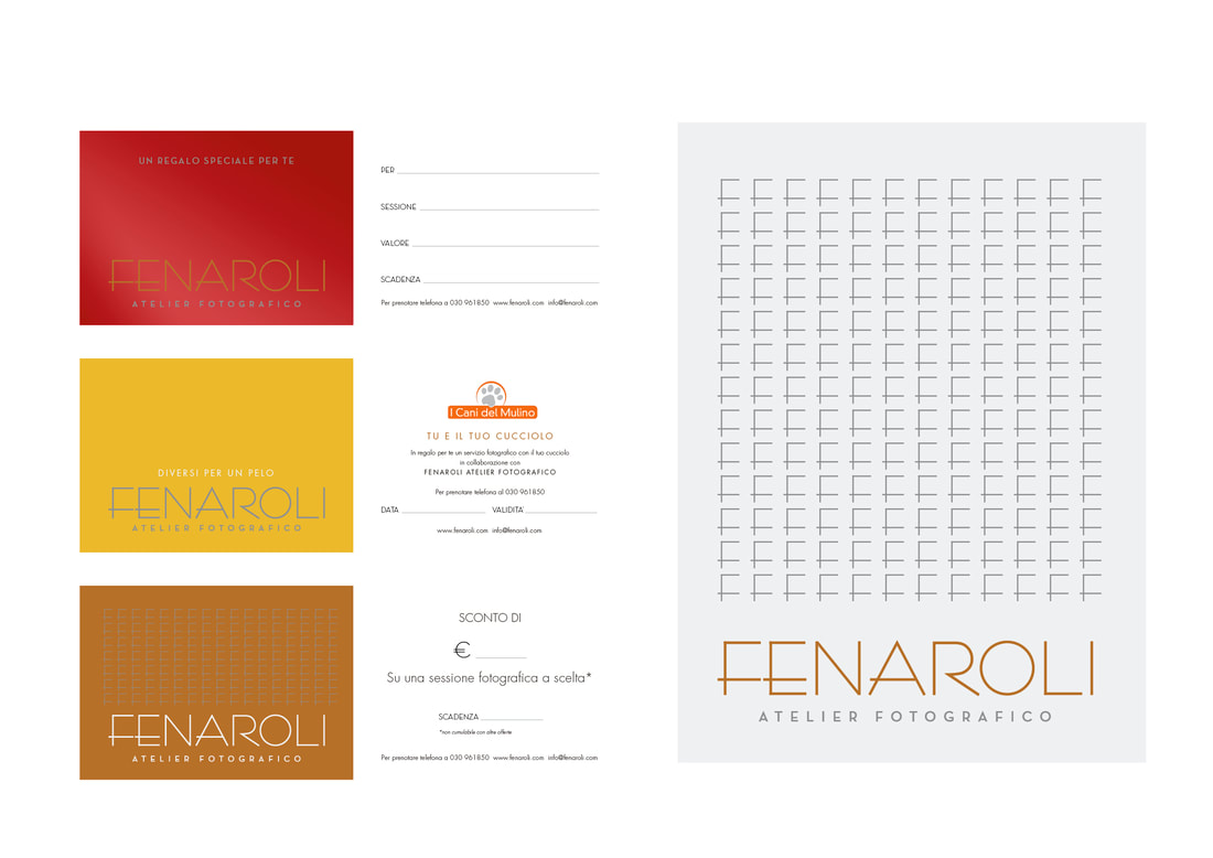
Courage and discipline are required to tear down and rebuild a long established company identity in this way, but if you trust your new branding, it’s also incredibly liberating. Rebrands of this scale aren’t just about a fresh look, they are about you feeing differently about yourself and your company. A successful redesign will generate the momentum to propel you further and faster into your new future.
Fenaroli were so enthusiastic and confident about their new identity, they asked us to redesign their offices – from the colour of walls and furnishings to the design of client areas with wonderful, bespoke decoration. We’ll be publishing photographs of Fenaroli’s stunning makeover very shortly, as well as insights and commentary from mother and daughter directors, Renata and Gloria Fenaroli.
let's play |