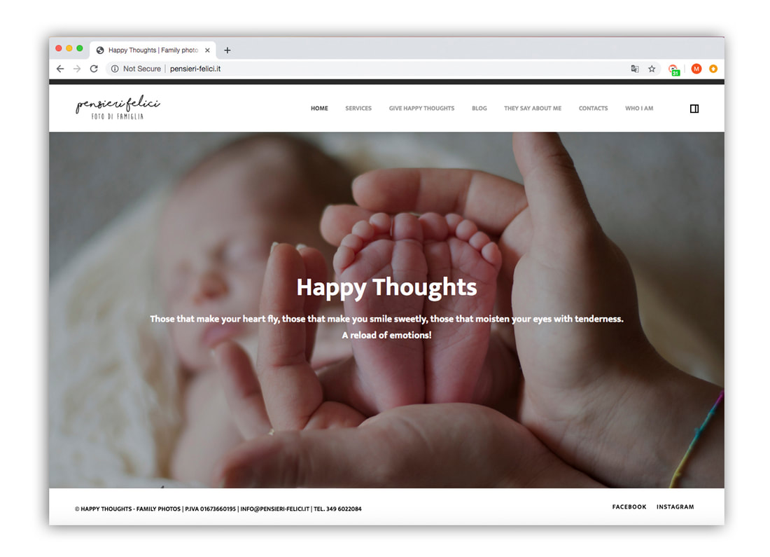
Anna’s beautiful photography boasted a wonderfully intimate atmosphere, making her baby and family-based shoots especially popular. But her logo’s hand-drawn aesthetic was especially difficult to read, scaled badly when used as a logo and also ignored Anna’s USP: her fantastic use of colour.
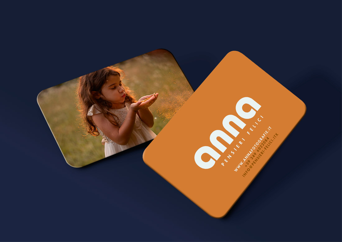
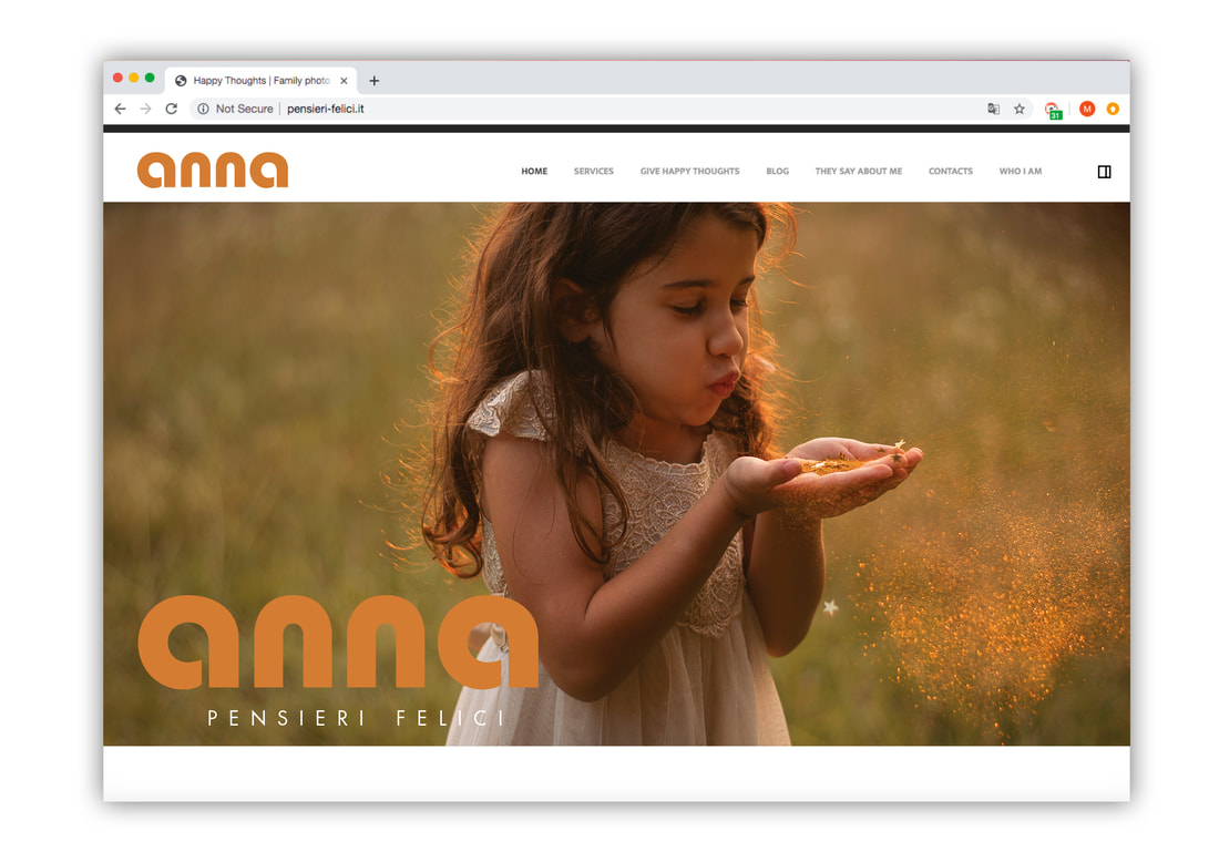
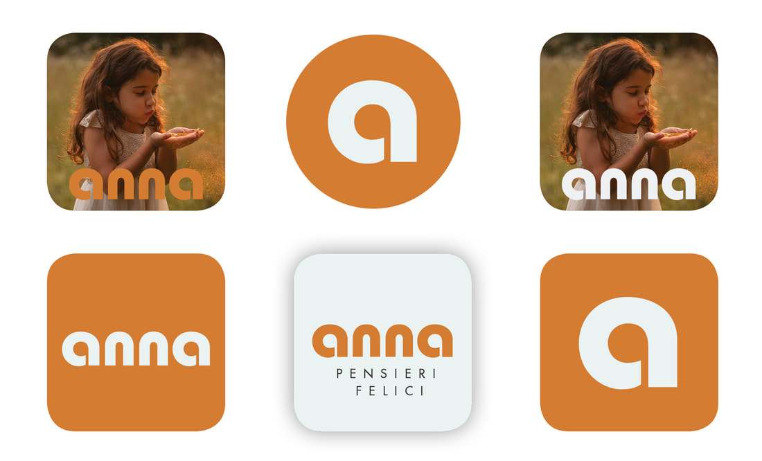
The inspiration for Anna’s new logo was, of course, Anna and her work. We needed an identity that was a friendly and welcoming as her photography, so we chose Bauhaus – supported by Futura – coloured in a warm rich orange, inspired by her sunset-saturated images.
Bauhaus’s thick, monotone stroke and geometric design can often overpower. But with just four characters in Anna’s name and a satisfying rhythmic mirroring of the distinctive ‘an’ and ‘na’, the font became a confident and engaging wordmark. 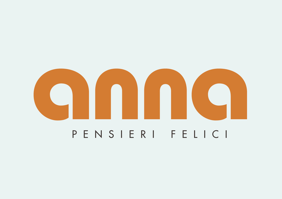
A vital part of the rebranding process is sitting with the photographer and choosing the images that best represent them. Partly for the practical purpose of culling superfluous work from their website – less is always more – but also, more importantly, to help them identify what their own strengths are. Our rebrands are aimed at making *everyone* look at our client in a new way, especially the client themselves.
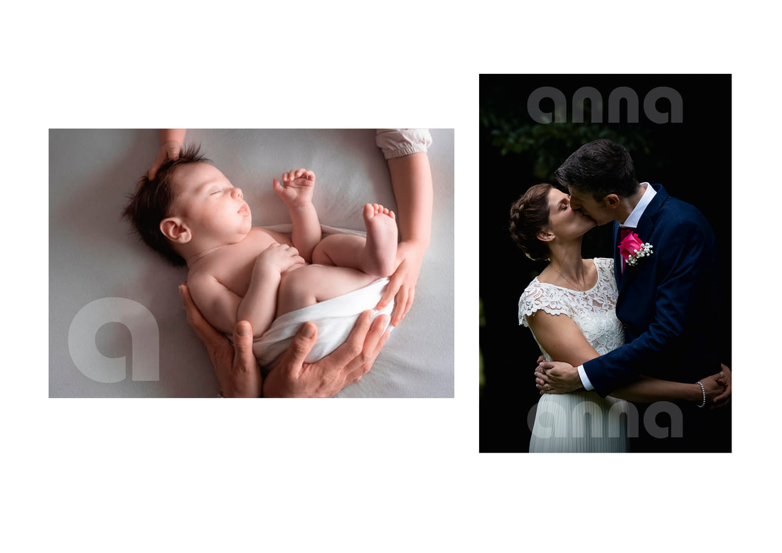
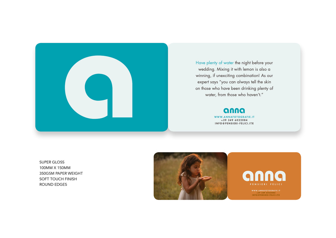
Anna had already done the hard work in her previous mentoring system, and had an excellent eye for her own work and incredible consistency of form. We knew straight away that she had a wonderfully evocative photograph that was powerful enough to represent her whole brand, and we used this on her business card. 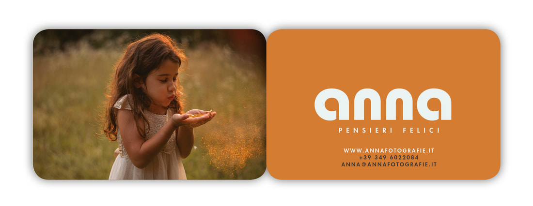
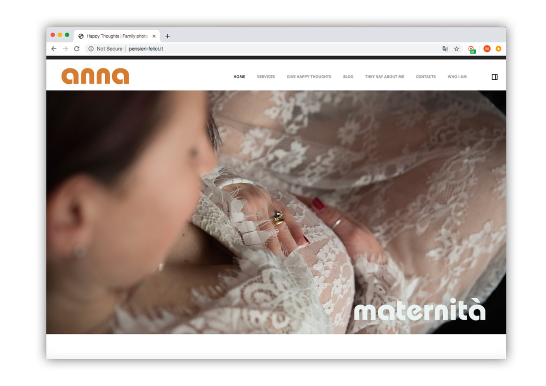
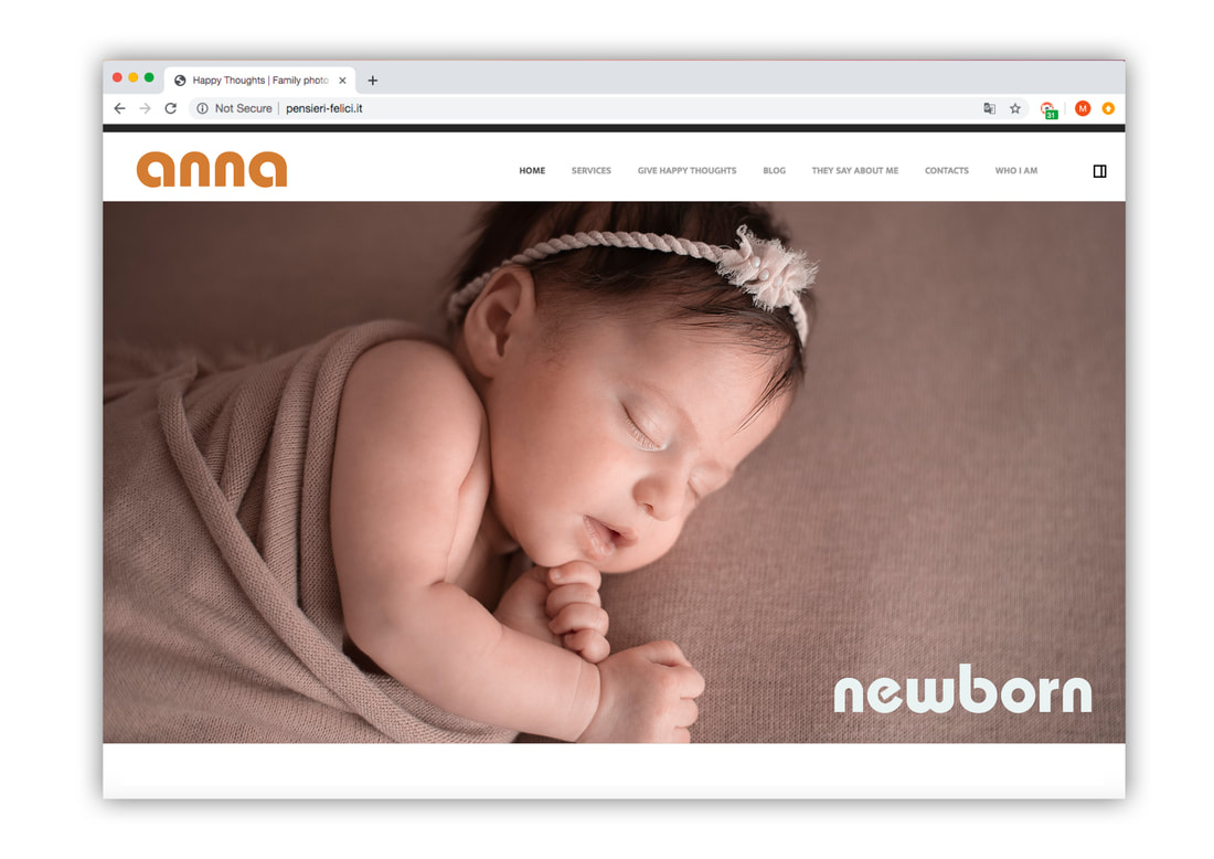
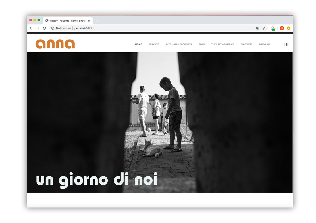
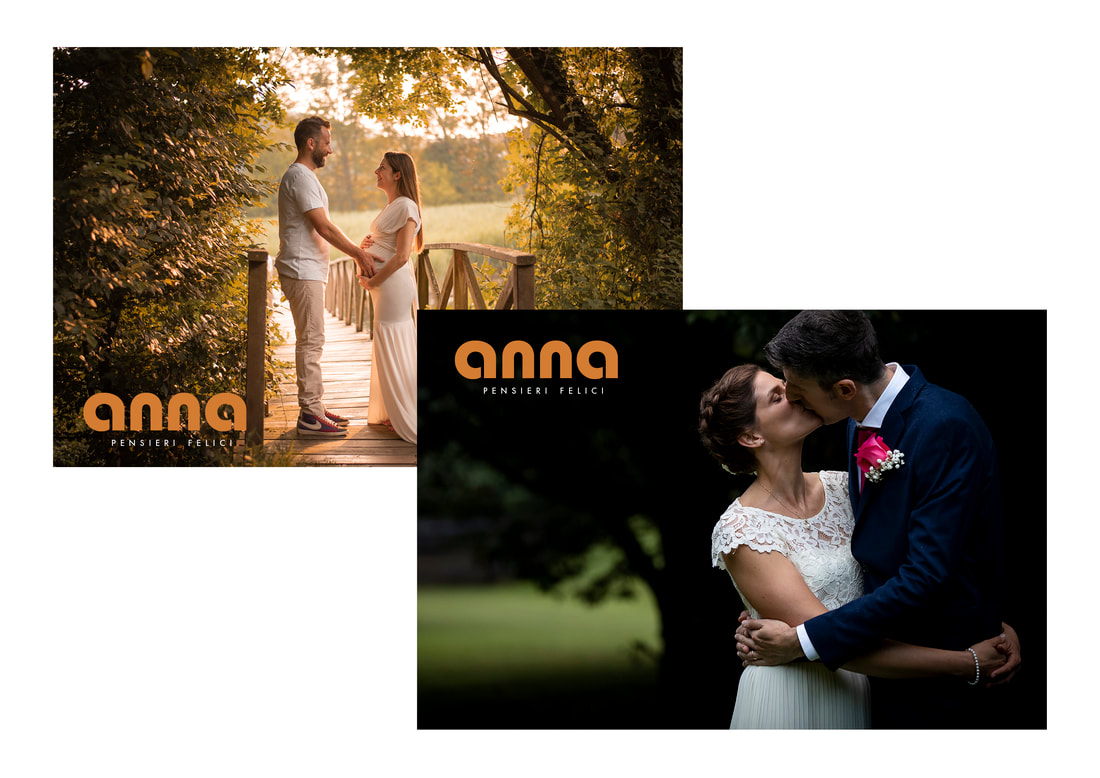
Anna’s existing website obstructed many great photos with slogans and editorial messages...
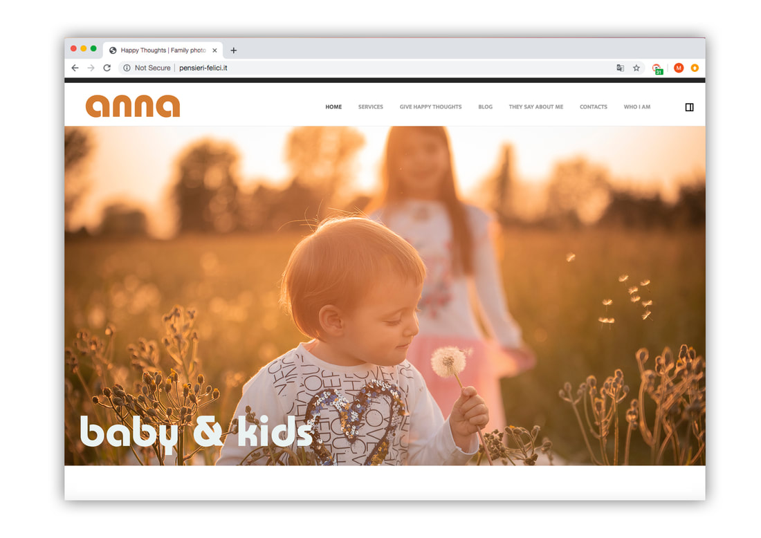
...but it was a simple process of applying her new colours and typography and then not getting in the way of her great photos.
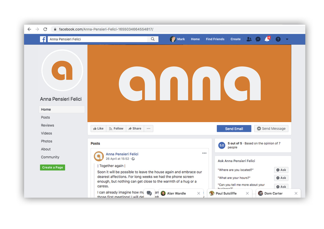
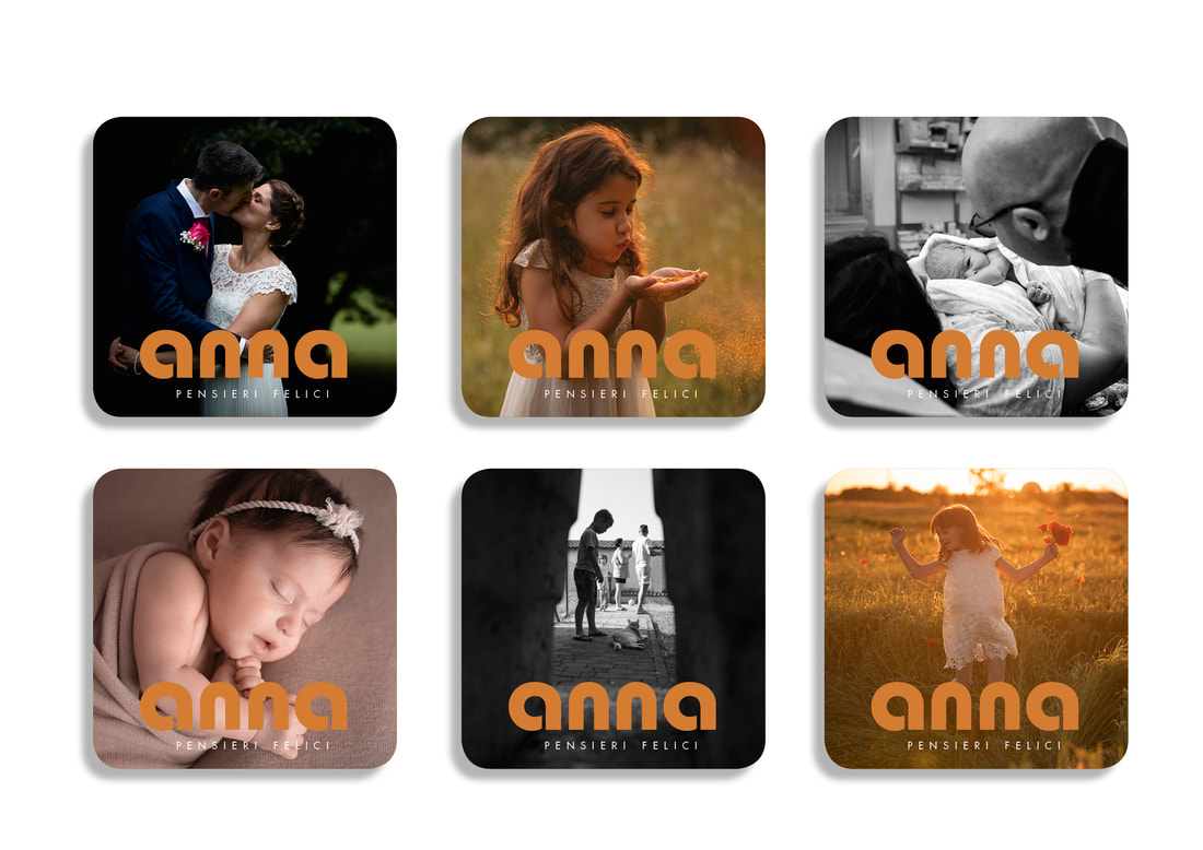
We cleaned up all of Anna’s social media channels, as well, to keep her identity consistent across all touchpoints. Short teaser videos are an easy and attractive way to promote photographers, and square format ratio mean they work are optimised for instagram but look great tagged across facebook and twitter as well.
As well as digital watermarks, we helped prepare large exhibition stand displays for an upcoming Wedding photography conference. This was a great opportunity to reveal Anna’s new brand and get immediate feedback.
Anna wanted to promote herself more creatively at this event, beyond the usual flyers and posters, so we decided to print some tips-for-the-bride cards instead. These unusual promos highlighted important aspects of Anna’s personality – her warmth, empathy and practical thinking – and proved a welcome respite for many of the brides-to-be.
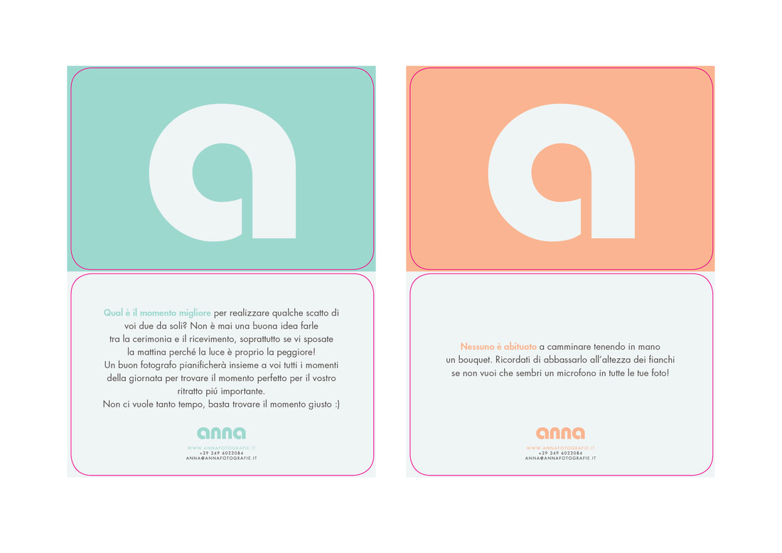
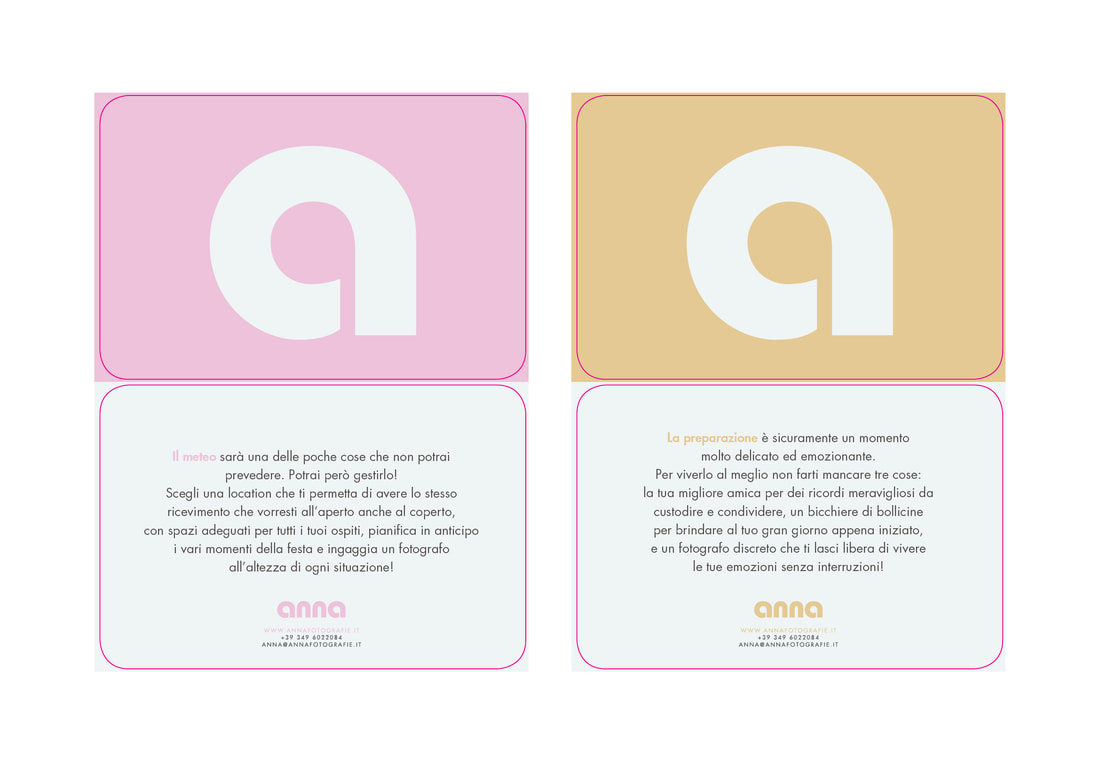
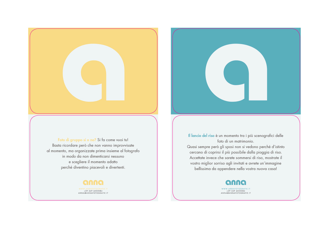
Using printed materials to communicate her brand rather than show her photography was a bold gamble that paid off. Her cards were much admired (and collected!) and drew plenty of prospective clients to her, proving that branding is more than just how you look, it’s the values you project.
|